New House - Inspirations for Transitional Living Room
/The myriad halloween activities are finally over, and it certainly felt like a marathon with pre-Halloween parties and preps for class treat bags. Friends are now starting to schedule their holiday parties. For us, we'll skip hosting parties this year, since the rental isn't the best space to hold gatherings. All this party planning reminded me of how the Mr. and I have designated areas at the new house that will make an entertainment hub. One such area will be our living area opposite to the kitchen.
The builder's floorplan has an eating area parallel to the kitchen, with an adjacent living and dining area at the back of the house. We decided to do things our way...
Forget about that eating area. Who needs 2 tables that are practically in the same area? In place of the eating area, we will have a sitting area/ living room there. The builder's living/ dining area would become one large dining area (we'll talk about the dining room in a future post and leave it spare for now).
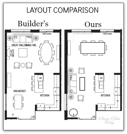
One of the advantages of having an open floorplan with the same flooring material throughout is the option to designate areas without worrying about them spilling over each other. Without a typical builder's tiled eating area, we were able to take advantage of the new trend of an open living kitchen area, such as these:
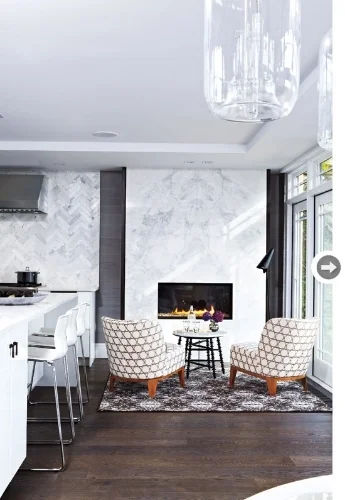
image via Style at Home

image via nobswall.com
Back at our old house, guests would spread themselves around our open ground floor, snacking at the dining room or chit-chatting in the family room. I think the open space floorplan at the new house would make another great entertainment hub. The living room becomes the focal point through the entrance from the hallway, while the kitchen is tucked away on the right side. Hence our design plan to keep the kitchen muted and let the living room take the glory.
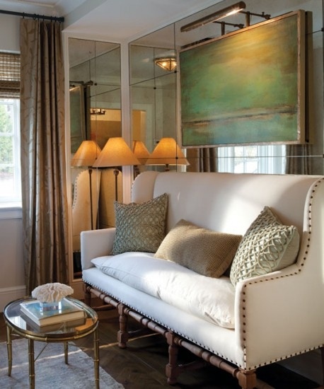
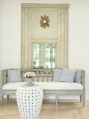
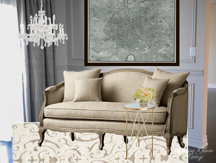
We had planned for a more formal living room at our old house, since we had a more casual family room for us to put up our feet. However, there wouldn't be a family room on the ground floor at the new house. That means, while we still want the living room to be an elegant focal point, we'll keep it a bit more transitional so that it's also a comfy spot for plopping down. Here are some photo sampling of my vision:

image via Sarah Richardson Design

image via Joss and Main

image via olystudio.com
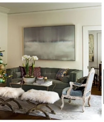
image via horchow.com
Our living room space is narrow, so the furniture placement such as those above would be ideal to maximize seating. Large art piece above the couch, pair of side tables flanking each side, and some extra seating on either side of the couch create a simple symmetry suitable for a small space. It would also be a nice setup for us to participate in our guests' conversations while working in the kitchen.

I've been doing some virtual window shopping for the living room. Can't wait to finally be able to "check out" my carts when it's closer to move-in time! I'll be sharing some of my finds for the living area soon. Remember to check back to get a glimpse of our living room in transitional style!
We're not usually rule breakers, but when it comes to design, it's ok to set our own rules that work better for us. Which room in your house is not done in a layout as suggested by the builder's floor plan?