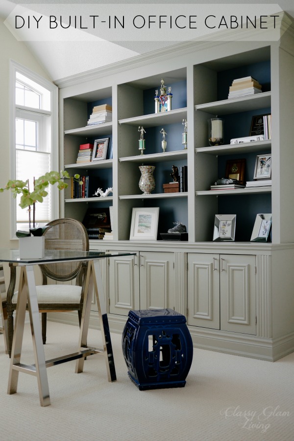
Would've-Could've Series - Living Room
/
Even though we've moved out of our old house, we've been going back to clean it. It's only right to hand over the house to the buyers in a truly move-in ready (clean) condition... and just another excuse for us to linger more until closing. As the Mr. and I walked into the empty house, we still couldn't help but fall for the abundance of light that pour in from the patio doors to the living/ dining room. The sitting area was another space that we have yet to tackle before we sold the house. We staged it with two armchairs that we got for the family room, so that it didn't appear too empty for the property listing photos.

However, if we had stayed at the house, we would like to decorate the sitting area where it's calming to chillax with a drink, in an elegant, classic style. Something simple with smaller pieces, as the area is only around 10'x14'. Here are some of our inspirations for the sitting area:

via http://prettystuff.tumblr.com
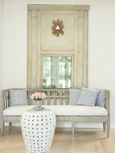
Do you see a common theme going on in these 3 images? What we were looking for was a settee, a small accent table, and a piece of wall accent. We wouldn't be able to fit a coffee table in front of the settee, since that would block the path to the patio door.
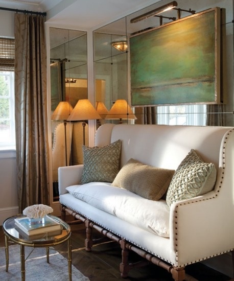
We have flipped back and forth on a settee style, but we always go back to one with a more classic line. This would've been our choice:

Source: Restoration Hardware
Its simple lines is a contrast to the tufting on our dining chairs. We also loved the welcoming feel of those curved sides, as if those arms are hugging the person sitting on it.
As for an accent table, we wanted one with a shiny finish to distinguish itself from all the wood furniture in the room. Chrome or brass finish in these styles would complement our decor:

Sources: 1. & 2. One Kings Lane; 3. & 4. Joss and Main.
We ruled out the pedestal tables like 2 and 3, since our dining table is already quite chunky-looking. An accent table with skinnier legs would give the area a more open feeling.
If I had the time, I would've started on my living room DIY art project. I even had the poster size of this Plan de Turgot map printed!

I found on Pinterest that the New York Public Library has a collection of beautiful maps that are in the public domain and available for use. Considering the Restoration Hardware version costs several thousand dollars, I was ready to put my non-existing decoupage skills to good use. Well, that was the plan... the prints are now packed away for an art project for our new house (if I ever get around to that!)
To complete the living room's sitting area, we would add a lightly patterned area rug and a gorgeous chandelier for some sparkles.
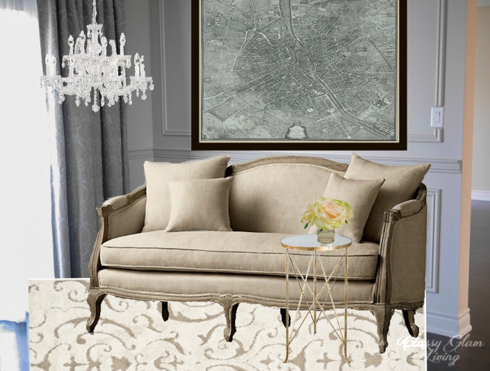
Sources: Rug and chandelier - Joss and Main.
Nope, we're not done yet! There was still the opposite side of the room. We went through different design concepts for that area, one of which included a faux fireplace (just a mantle) with two armchairs in front. In the end, we decided to just keep the area less populated. Otherwise the left side of the room would look way too crowded, with the dining table in front of it, creating an imbalance against the simple sitting area.
The Mr. and I enjoy the occasional drink at night, and the left side of the sitting area would've been a great spot for a bar cart. As I kept searching, the styles got all the more vintagey. I wasn't sure if I would want to start adding antique pieces to our decor.

Sources: 1. Layla Grace, 2. 1stdibs, 3. furbishstudio, 4. Kravet
Choices 1 and 2 were on the vintagey side, and I came to realize that I was looking for something a bit wider than a regular cart. Choices 3 and 4 were of a more contemporary style, and we would've chosen #4 for its size and also the higher edge around the shelves for its added details.
Still not very convinced about how the chrome and modern flare would go with our existing pieces, I kept searching and came about a console table that was narrower in depth than bar carts. That would be great to free up some space between the bar and sitting areas. Simple tapered legs in antiqued gold finish would blend in with the wall, while picking up the wainscoting details.

Source: bellacor
While we were at ZGallerie during our Chicago trip, we found some pieces that would've made our bar area come alive! These bar essentials are but a few statement pieces that we would love to incorporate on the console table.

Source: ZGallerie
Can you imagine how much time we spent at the store that day? We also roamed through the art collections there! We found a piece that would pull all the colours in the living/ dining room together, while adding a totally different colour.

Source: ZGallerie
This painting isn't a dining related piece of art, but it's pleasing to look at with the soft colours. The cream and khaki colours mimic our wall colour, while the blues and greens are of a similar tone as the blue-green in our draperies. The deep pink serves to bring out the bar area as a focal point as you walk in from the dining room, or sit on the body-hugging settee from across the room.
Well, I couldn't have had the Mr. poured himself a drink and then had to walk all the way across the room to the settee! No no, I would need to get him a chair by the bar, so he could sit right down! The Mr. prefers armchairs, so that his monkey-long arms are not just dangling on the sides. I wouldn't want one with thick covered arms, that would look too heavy and defeat the purpose of keeping the bar area light with simple pieces. Armchairs with thin arms like these ones below have a less clunky look:

Sources: 1. Joss and Main, 2. & 3. One Kings Lane
While I was searching for the bar area armchair, something else caught my eyes. Of course, I would need a small accent table on which the Mr. can put down his drink also! A little garden stool adds a little casual vibe to the room, and a darker coloured piece would ground the setting.
And here would be how the bar area would've all come together... everything at arm's length for the Mr.'s enjoyment =)

This is the view of the back of the living/ dining room as one would come through from the dining room entrance. I think this would've been the best use of space for us, keeping everything simple yet practical. If we needed more seating there, we could easily grab a dining chair from the adjacent dining area.

The Mr. looked impressed as I showed him this design board. We've always talked about our design plan for the living room, but this is the first time that we've actually seen it "come to life". Our new townhouse's living room would be a longer horizontal space. I have been gathering furniture placement ideas and curating potential furniture pieces on my Pinterest board. Check out my living room Pinterest board to get a glimpse of our furniture placement ideas for the new living room! Remember to check back for another set of "Would've-Could've" series!