Would've-Could've Series - Master Bedroom
/
As you can probably tell by now, we like to decorate our home after much pondering. The Mr. never embarks on a new project until we're certain that it's the look that we want, and one that we wouldn't get sick of for a while. Well, all the pondering takes time, and then our preferences change as we go. As with most homeowners, we left the master bedroom in our first home untouched (other than painting a striped accent wall), as we got side-tracked by other more pressing (interesting) projects around the house. When we moved into our next house, the one we just sold, we vowed not to leave our master bedroom un-decorated like last time...
Since we had the builder converted an extra bedroom for our dressing room, we deleted the walk-in closet in our bedroom. Our room essentially became a big rectangle, within which we were able to create a large sitting area. The generous wall space gave us lots of furniture placement options, so much so that all options seemed viable, and our pondering process once again took over us. You saw the projects that kept the Mr. occupied during this time. It was only natural that we once again left our own bedroom untouched before we moved again!
Today, I'm sharing with you some layouts and mood boards that I've created from my Pinterest inspirations.
With our room being a rectangle, we had the option to put our bed near the window wall (left side of the room, which was how we had it) or at the other end of the wall (right side).
Option 1 - Bed near window wall (left side) - Sitting area on opposite side of the room (right side)
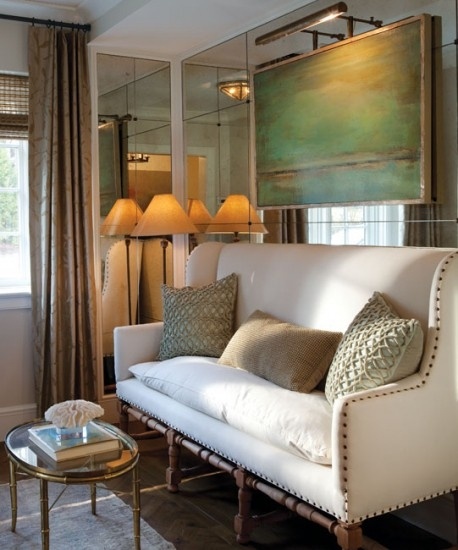
With our bed near the window wall, the empty designated sitting area became the little man's hotwheels test drive area and beyblades arena. If I wanted to reclaim that area, all I had to do was create a small living room. I was also inspired by this photo, and wanted to incorporate a mantel at the wall between the two windows.
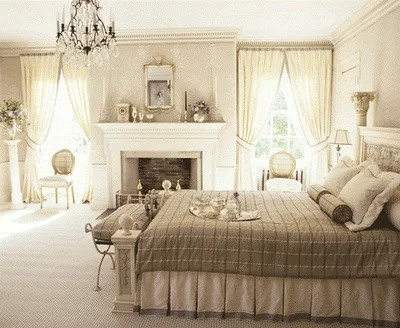
via Traditional Home
Here is our bedroom's design and layout board using the floor plan as a background. Main colour would be beige/ cream, with accent colours in warm undertones such as bluish grey, mauve, and earth colours.

Sources: colour inspiration via Valspar; sitting area source unknown; fireplace inspiration via Tradition Home; chandelier and medallion rug via RH baby and child; floral motif rug via Joss & Main; chaise via Horchow.
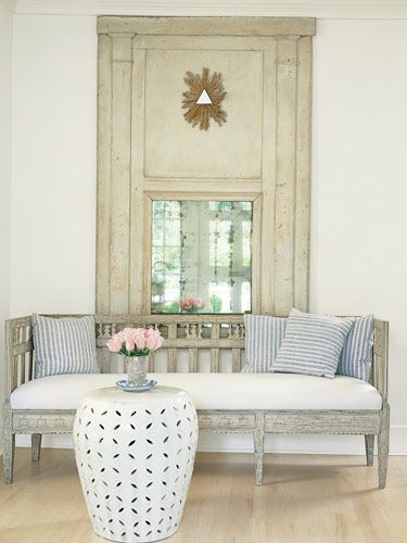
This would've been the "easy" option, although the "trim crazy" Mr. would still want to put some wainscoting along the walls, similar to the sitting area inspiration photo. The couch at the sitting area would be placed along the wall of the entrance. I would keep the sitting area neutral, with pillows in accent colours and a pattern rug to ground the lightness. The rug at the bed would be in a lighter colour, since our bedding already has a pattern and is of a mid-tone colour. A chaise would go in the corner, beside the fireplace. We have 2 light fixtures in the room, and I think this chandelier would be a good size (Yes, it's from RH kids... who says you can't use it in a room for adults?)
It has been our plan for the longest time to go with this option, until the Mr. threw a curve ball and suggested putting the bed on the right side of the room. Leaving the fireplace between the two windows, and we would have a mini family room. He tried to entice me to this idea with a vanity table. I'm always open to new ideas, and a beautiful vanity table, so I gave him this design option.
Option 2 - Bed on the right side of the room - Sitting area on the left - Vanity table
One would be greeted with a sensual vibe of the master bedroom, with the vanity table beside the window at the entrance's direct sight line. Two inviting armchairs flanking the fireplace, with a coffee table in gold tone finish, would set the focal point of the room. I would incorporate a dresser beside the window for more storage (yeah!) and a beautiful vignette. This design would even out the space, with a simpler sitting area.

Sources: console table via Vogue; gilded bench via Elte; vanity table via Architectural Digest; tufted arm chairs via Anthropologie; coffee table via wellappointedhouse.com.
Option 3 - Bed on the right side of the room - Sitting area on the left - Wall unit
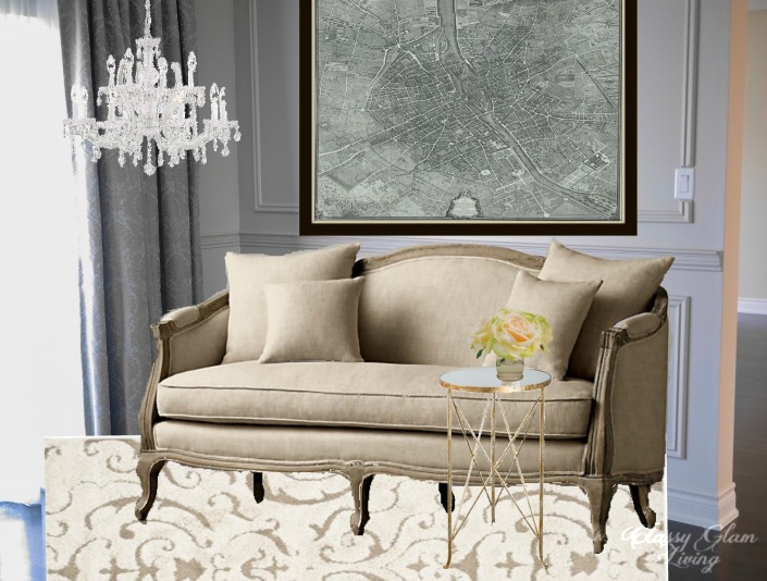
After the Mr. accomplished his masterpiece in the office, he sprung another design option for our master bedroom's sitting area. He said the office's built-in was a practice run for our master bedroom's built-in... I think he was trying to sneak in a TV at the built-in unit to challenge my "no TV in the bedroom" rule. To satisfy his curiosity, I re-jigged the sitting area by putting in a comfy couch in place of the two armchairs. Afterall, we would need seating appropriate for lounging if there's a TV! I also excluded a fireplace, otherwise the left side of the room would look too heavy with too many chunky pieces. I think a similar setting as in the sitting area inspiration below would look ultra-glam!

Sources: wall unit via One Kings Lane; sitting area via New England Home.
Our master bedroom in the new townhouse will have a small sitting area, and we've already gone through several different designs of that space. We want to maximize its wow factor and also make it look roomy in a small space. Let's just hope this time around there'll be less pondering, so that our bedroom won't be undecorated before we move again!
Which option do you like the most?