Easiest Steps to Edit Brighter Interior Shots for Instagram - My Recipe

Easiest Steps to edit brighter interior shots for Instagram.jpg

A new year brings the urge to start anew by purging.  My own Instagram (IG) feed gets the same purging treatment.  As I went through my earlier photos on IG, I noticed how the photos have evolved.  It has definitely been a learning process.  From photo composition, to styling a space, to cropping a photo to hide unsightly cables (as most I could), Instagram has been a fun ride and I'm still learning lots from my fellow interiors enthusiasts!

Now that I'm not limited to taking photos at night with incandescent lighting, the photo quality has definitely benefited from more daylight shots.  Ideally, I would be taking photos at the time of day when the room has the most natural light.  Of course, this ideal situation rarely exists.  So, I started to experiment with photo editing apps.  

I apologize to have deceived you that our house is filled with an abundance of beautiful sunlight...  well, at times it does, depending on the time of day.  But sometimes it's just impossible to shoot with bright daylight, when we're experiencing a string of gloomy winter days.  This is when these photo editing steps would really come in handy.

Easiest Steps to edit brighter interior shots for Instagram.jpg - 1

I want to share with you these easy photo editing steps that will help your photos appear even more beautiful on your followers' feeds.

Disclaimer:  I'm not a professional photographer, nor a graphic designer.  I rarely take photos with a tripod (ya, and I'm an interiors blogger!).  This is not a tutorial on how to take nice photos, but a post-editing method that works for me.  Although I know the camera settings, sometimes I just want to turn the camera on and snap a photo, enhance my photo in seconds and upload it to Instagram.  (This post is NOT sponsored by the apps mentioned).

My goal is to enhance my original photo to be brighter, sharper, and yet still appear natural and untouched.

First and foremost, learn your own shooting style and start with a well-composed shot.  Secondly, try to take the initial shot as straight as you can (using the camera's on-screen level), or straighten the photo as the first step of editing.  

Just as importantly, since you're using phone apps for editing, make sure your phone's screen brightness is set to its brightest before you start editing photos.  If your screen's brightness isn't at its brightest, you may over-compensate the brightness, making the photo extra bright.

Without further ado, these are the steps that I go through before I post on IG.  They may seem lengthy, but it only takes me seconds now that I've got the hang of it.

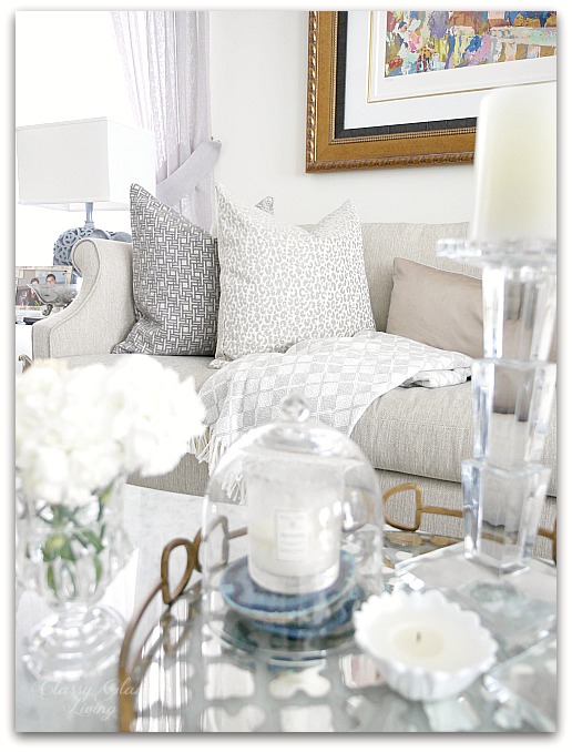
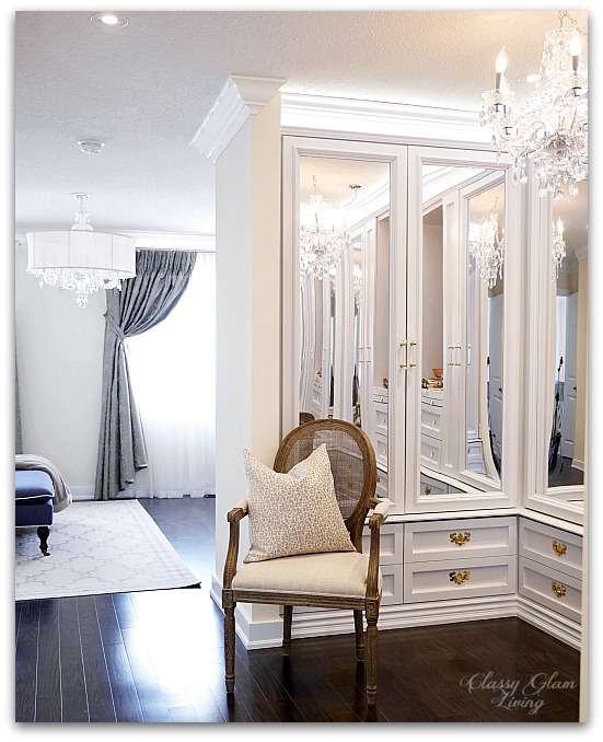
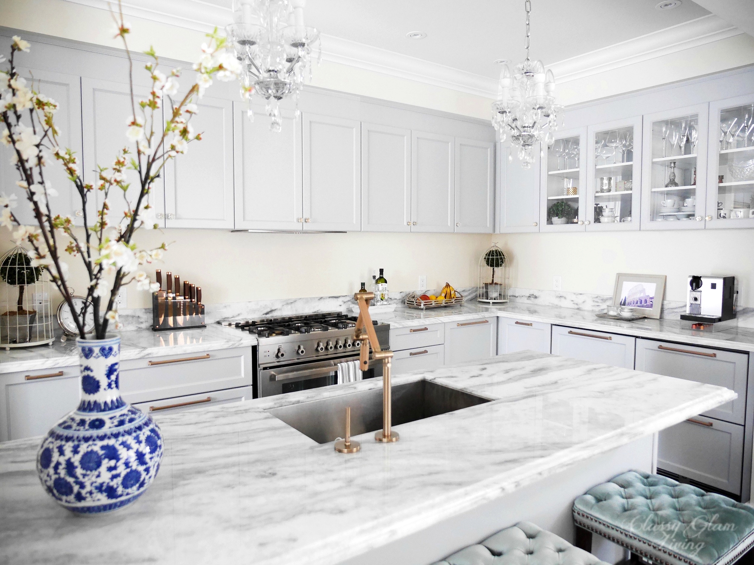
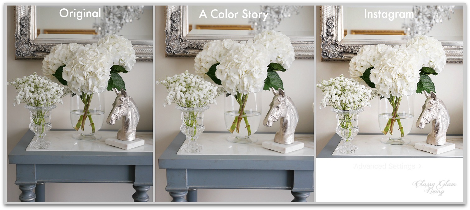
Here's the original version of this interior shot:

Easiest Steps to edit brighter interior shots for Instagram.jpg - 2

It wasn't a particularly gloomy day, but the lighting from the window behind the sidetable made my shot appeared gloomy.  I opted to take the photo without cranking up the exposure compensation too high to avoid washing out the light at the window.

PRIMARY EDITING WITH A COLOR STORY

A Color Story is my favourite photo-editing app for interior photos.  It's an awesome free app that's user-friendly and comes with filters that suits my needs without resorting to in-app purchased ones.  Just like dirty laundry, I like the whites in the photos to appear white, not a light grey nor tinted.  A Color Story does just that, brightens and whitens photos amazingly!

Once I've selected a photo for editing in A Color Story, I usually up the exposure for the photo.  The quickest way to do that on the app is by going to Tools > Adjust > Curves.

Easiest Steps to edit brighter interior shots for Instagram.jpg - 3

Then just drag the middle dot out to the left slightly, until you're satisfied with the brightness.  I usually drag it to a point until the objects look like the photo was shot in good light.  Tap on the check mark after you're done with this step.

Easiest Steps to edit brighter interior shots for Instagram.jpg - 4

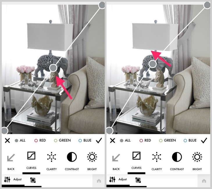
Next up, we go back out to the main menu to access the filters.  I found the ESSENTIALS > EVERYDAY filter to look most natural for interiors.  It brightens the photo and increases the contrast.

I usually choose a setting somewhere in the middle of the filter meter to avoid over-exposure and washing out the details of the photo.

Easiest Steps to edit brighter interior shots for Instagram.jpg - 5

Click DONE, then SAVE & FINISH.  

Easiest Steps to edit brighter interior shots for Instagram.jpg - 6

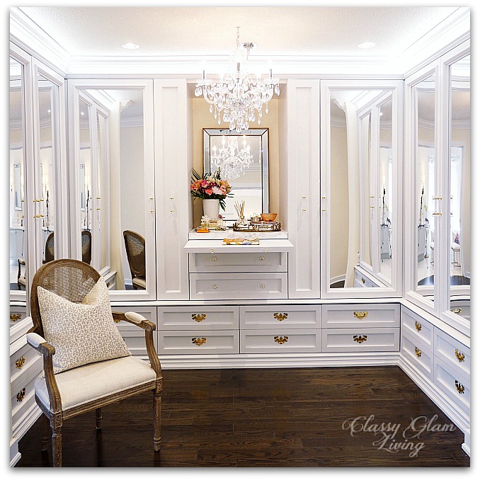
That's right, the photo looks a lot better than its original version already.  You can tell the white is now whiter, and the reflections from the accessories are shinier.  I used to just leave it as is and then would go ahead to post on Instagram.  

However, your photo can still appear better on Instagram!  Here are a few more finger-sliding edits that I would attempt at before the final posting.

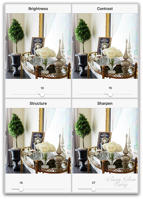
SECONDARY EDITING ON INSTAGRAM

I don't use any of the filters on Instagram...  they just never seem natural for interior shots.  But their built-in editing features are great for interiors.  I go in the order from left to right, from Brightness, Contrast, Structure, and to Sharpen.

Start by accessing the editing tools:

Easiest Steps to edit brighter interior shots for Instagram.jpg - 7

1. Brightness

Increasing the brightness just a tad more (I usually go to at least 10) gives the impression that the photo was taken with beautiful daylight.  For this photo, I went to 14, and well, we all know this photo didn't start off like this:

Easiest Steps to edit brighter interior shots for Instagram.jpg - 8

2. Contrast

Adding brightness to the photo would wash out some details, so I would bring up the contrast to balance the brightness.  Around 10 would be a good point.

Easiest Steps to edit brighter interior shots for Instagram.jpg - 9

3. Structure

I love this editing tool, which gives some clarity to textures in the photo, making the objects appear less flat.  I usually go up to 15, anything beyond that would make the photo seem too harsh.

Easiest Steps to edit brighter interior shots for Instagram.jpg - 10

4. Sharpen

The sharpening tool is what makes everything pop in your photo, giving it a crisp finish.  For me, the magic number seems to be 27.

Easiest Steps to edit brighter interior shots for Instagram.jpg - 11

These are the 4 edits that I use every time before I post.  I would occasionally touch on some others, like Highlights, Shadow, and Saturation.  It all depends on the photo quality and the enhancements it needs. 

And that's it!  Now you can add your hashtags and post!

Here's a summary of the progression using the editing steps above:

Easiest Steps to edit brighter interior shots for Instagram.jpg - 12

This is the enlarged final Instagram version that I posted:

Easiest Steps to edit brighter interior shots for Instagram.jpg -13

It might've seemed like a long process.  But it takes less than a minute for me to do all the editing involved.  To get an equivalent shot, I would need to set up my tripod, since my camera would have to be out of my shaking hands and be still to capture an equivalent amount of light for a sharp shot.  Again, I'm not a professional photographer...

Here are several more photos that went from drab to a bit more fab...

Original version of these white roses on our coffee table:

Easiest Steps to edit brighter interior shots for Instagram.jpg - 14

Editing with A Color Story using the same steps mentioned above:

Easiest Steps to edit brighter interior shots for Instagram.jpg - 15

Final editing on Instagram, adjusting parameters mentioned above:

Easiest Steps to edit brighter interior shots for Instagram.jpg - 16
Easiest Steps to edit brighter interior shots for Instagram.jpg - 17

Final product:

Easiest Steps to edit brighter interior shots for Instagram.jpg - 18

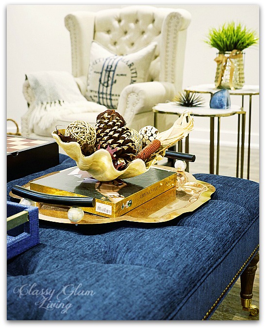
Here's the original version of our bar cart photo.  Taken on a gloomy day with my shaky hands...

Easiest Steps to edit brighter interior shots for Instagram.jpg - 19

First edit in A Color Story:

Easiest Steps to edit brighter interior shots for Instagram.jpg - 20

Final edits in Instagram:

Easiest Steps to edit brighter interior shots for Instagram.jpg - 21
Easiest Steps to edit brighter interior shots for Instagram.jpg - 22

Final product:

Easiest Steps to edit brighter interior shots for Instagram.jpg - 23

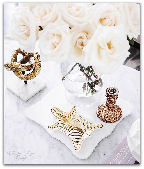
Another favourite photo of mine, our coffee table mirror tray adorned with freesias:

Easiest Steps to edit brighter interior shots for Instagram.jpg - 24

Final product posted on Instagram:

Easiest Steps to edit brighter interior shots for Instagram.jpg - 25

Here's a photo of the largest white flowers vs. the tiniest, Hydrangeas vs. Angel's breath:

Easiest Steps to edit brighter interior shots for Instagram.jpg - 26

Final product:

Easiest Steps to edit brighter interior shots for Instagram.jpg - 27

I feel like a magician who has just divulged secrets of the trade.  I hope I'm forgiven for deceiving you with the bright photos you see on my Instagram feed by sharing these editing tips with you.  They're super easy, so do try them out and play around with the steps! 

I actually do enjoy the editing process as much as taking photos around the house.  It's almost an art form in itself.  Just remember the goal is to enhance the photo to bring out its positives, while still looking natural.  Hope this post will help you in your IG journey!

What are some of your favourite photo editing apps?  Do share in the comments section!

Fall Decor Around the House

Fall Decor with HomeSense | Classy Glam Living

Buh-bye, Summer!  We've had a beautiful and hot summer in Toronto, but as much as I love this sweater season, I'm not loving the gloomy and rainy days of Fall.  I know I may be a bit late in writing about Fall decor, but I still want to document this transition with it being our first decorated Fall at this house.

I got my hands on some Fall decor accessories early on, back in first week of September!  I was incredibly honoured that I was invited to participate in HomeSense's Fall campaign.  It was such a fun experience to work with industry pros, from hair and makeup, to professional photographer and videographer, and of course the whole HomeSense crew involved in this Fall campaign.  Not to mention, how fun it was to be invited to go shopping for my fave home decor items!!

Here's my haul in the cart on the day of the shoot!  I was looking for warm metallic decor, but don't we always add a little more to our cart at HomeSense?  ;-)

The one item I was really hoping to get was the gold lantern, and wow, I found it!  The throw was a nice add-on item...  well, so were the rest of the goodies!

One that caught me by surprise was the tiered tray!!  I've always been on the look out for one, but never really found THE ONE.  I loved the bamboo details on this one and it was love at first sight!!

Throughout the past 2 months, I've gradually added these items around the house.  As the weather gets cooler, the use of warm metallics complements the woodsy Fall decor, enhancing our home with a cozy ambience.

Here's how I used the goodies from my shopping spree to decorate for Fall around our house.

The pack of Fall decorative balls in vignettes:

Fall Decor from HomeSense | Classy Glam Living
Fall Decor from HomeSense Family Room | Classy Glam Living 1
Fall Decor from HomeSense Family Room | Classy Glam Living 2

Here's the copper tiered tray from my haul, together with the decorative balls.  It adds just the right contrast to our cool-toned kitchen.

Fall Decor from HomeSense Kitchen | Classy Glam Living

This is the vignette at our entry way's console table.  I decided to make good use of this copper tray by moving it upstairs from its usual spot on our basement family room's ottoman.  I love the mix of warm metallics by adding the gold lantern from my shopping spree.

Fall Decor from HomeSense Entryway | Classy Glam Living 1

The wooden top of this console table helps break up all the gold tones in our entryway:

Fall Decor from HomeSense Entryway | Classy Glam Living 2

Just me showing some love for the gold lantern by moving it around the house =) ... Here it is on our living room's coffee table.  I've also added my beloved new throw on our couch:

Fall Decor from HomeSense Living room family room | Classy Glam Living 1

I changed out the blue pillow cover to this darker neutral...

Fall Decor from HomeSense Living room family room | Classy Glam Living 2

... so that the pillow covers are a neutral backdrop when I add Fall colours in the new silver earthware bowl:

Fall Decor from HomeSense Living room family room | Classy Glam Living 3

Then I realized, I still prefer soft colours in the living room over the bold Fall colours:

Fall Decor from HomeSense Living room family room | Classy Glam Living 4
Fall Decor from HomeSense Living room family room | Classy Glam Living 5

When I finally put out all the Fall decor, which wasn't long ago, I finally packed up these summer decor accessories:

Summer Decor Accessories | Classy Glam Living

Yes, I know, my transition in seasonal decor is, umm, slow.  Thanks to HomeSense once again for the invite to this unforgettable experience!  I was able to get the early bird dip in shopping for Fall decor and have my hands on these goodies. 

Now that I have our Fall decor down to a T, I think I can start making way for Christmas decor. I'm not really into bold red and green Christmas decor.  This beautiful display of soft metallics and pastel winter wonderland at the HomeSense showroom is just my cup of tea.

Have you started decorating your home for Christmas?  Do you have a colour theme?

My Love for Navy Blue and the Next Big Plan

Navy Blue Decorations Home Decor | Navy blue bathroom vanity | Classy Glam Living

Summer is officially here!!  ðŸ™Œ  ðŸ™Œ  Nothing spells summer like good ole' navy blue; its nautical vibe automatically lends a tranquil and relaxing feel to any decor.  At times giving off a relaxing casual vibe, at others, the deep hue is also seen in more traditional setting, such as the navy blue and white porcelain wares.  It's such a versatile colour for home decor, that it also takes the middle ground between a casual and traditional ambience - a contemporary colour anchor of choice as an alternative to the modern black.

How can I not love navy blue?  It's a softer contrasting colour over the harshness of black, and I especially love a blue and white theme in our home.

The first time we encountered the power of navy blue was probably at our previous home.  We used a navy blue as the background colour of this DIY office built-in, where the colour not only helped ground the unit but the whole office amidst a cream and greige palette.

Navy blue backing in DIY built-in unit | Classy Glam Living

Our love of navy blue continues as we decorate our current home.  A blue and white porcelain chinoiserie vase lends its contrasting touch and adds some colour to this otherwise light-coloured foyer vignette.

Blue and white porcelain chinoiserie vase in entry foyer table | Classy Glam Living

I experimented with the same vase in our kitchen, and I loved how it draws the eyes full circle and back around the kitchen.

Blue and white porcelain chinoise vase in kitchen | Classy Glam Living

In our living room, the pair of navy blue pillows complement the blue tones in the statement painting, and ground the soft toned space.

Navy blue pillows in living room | contrasting colour | Classy Glam Living

I keep these blue agate coasters on the coffee table to provide continuance of the navy from the painting and the couch.  These lime rocks that little man collected from the school playground completes the blue and white touch to this crystallized vignette.

Blue and white decor in living family room | Classy Glam Living

A vignette on our dining room console isn't complete until you add a touch of navy on it.  It echoes the French blue of the console table, while acts as the contrasting object in this simple setting.

Blue and white porcelain chinoise vase in dining room console table | Classy Glam Living

The family room is the best place to extend the casual vibe of navy blue.  This pair of nautical pillows suits the theme perfectly, while the tufted navy ottoman by Sarah Richardson keeps the space from being too casual.

Blue and white decor in family room | navy blue ottoman | Classy Glam Living

Sometimes I wonder if I would still use navy blue in a girl's room.  Well, good that we have a boy!  I scattered navy blue pillows on his bed to balance the grey and white softness in his room.

Navy blue in boy's room | Classy Glam Living

Of course I didn't leave his playroom alone!  It's the perfect space to add some navy blue with this fun union jack rug, and picked up by the navy chevron pillow in his work space.

Navy blue in playroom | union jack rug | Classy Glam Living

And I couldn't leave our master suite alone either.  Our dressing room and master ensuite across are both in soft white and grey.  I always prefer to have a contrasting colour in any room, so the navy blue bench at the foot of our bed helps to draw the eyes inward.

Navy blue bench at foot of bed | dressing room decor | Classy Glam Living
Navy blue bench at foot of bed | crystal chandelier master bedroom | Classy Glam Living

So, as you can see, navy blue is all around our house.  Where do all these lead to?  Well, I've been contemplating about some big plans for our master ensuite.  Can you guess how navy blue relates to this plan?

Let me give you some hints:

And I changed yet again...  I was originally going for a spa-like feel in the ensuite, so I had previously wished for a white and grey master ensuite in this design board, ie. grey cabinets.  Yet, everytime I see a deep rich navy vanity (thank you Pinterest), I would fall head over heels with that luxurious contrast it gives to the bathroom.  Oh, especially when it's paired with a marble countertop and brass hardware...  I think I'm totally in love.

It may be a daring move, but I feel all the more certain that this rich luxurious look is the perfect match for our master suite's decor.  A navy blue vanity would offer great contrast to the light grey dressing room that's right across from the ensuite.

DIY Dressing Room Closet | Classy Glam Living

What are your thoughts about a navy blue vanity?  Would you consider it for your bathroom reno?