We Need a Drop Zone!!! + Design Inspirations
/This past weekend's gorgeous Spring-like weather has put me into cleaning mode. But just like how this Spring tease won't stick around for long, neither would this "cleanliness" at our home. The one main culprit is CLUTTER.

Mail, papers, homeless decor items...
One thing I'm not diligent with is dealing with all the papers that come through our door. No matter how much I try to cut down on our paper trail, some are still inevitable. At times (actually, most of the time), our dining table is a dumping ground for piles of papers and homeless decor items. On the rare occasion that it's cleared off, I snap a photo for Instagram:

It all comes down to the fact that I'm just not a good cleaner-upper. Our main floor has no closed storage at all, except for our kitchen and cloak closet. As much as I want to hide my keys and mail in a kitchen cupboard, it just doesn't make sense (and I better not start with that habit!). I desperately need a place to temporarily put away these things!
What I need is a drop zone/ storage/ command centre by the entrance. A designated spot where I can drop off my keys/ sunglasses as I walk through the door and hide the mail that I'll eventually attend to. A place where I can store papers temporarily until I file/ shred them, and where I can have a simple filing system for our family.
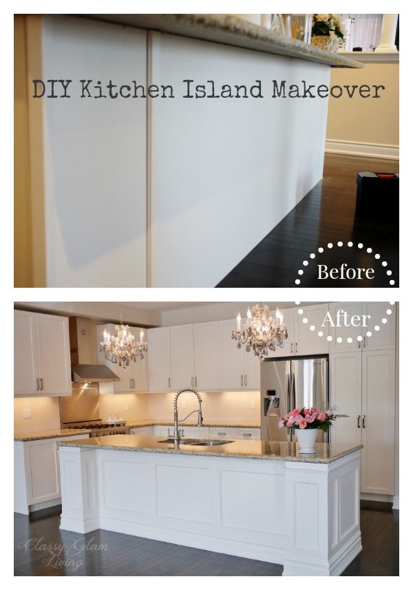
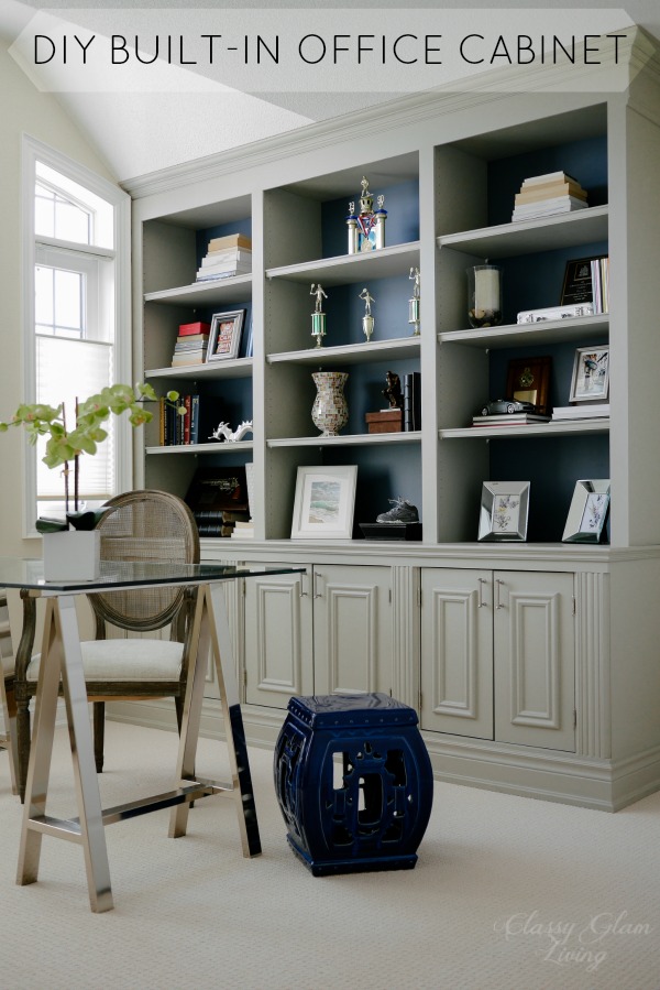
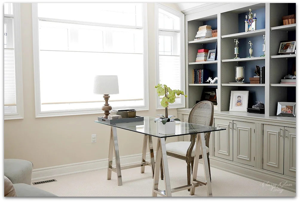
At the home office of our old house, the lower right cabinet of this DIY built-in unit was my drop zone. It wasn't ideal, since the office was on the second floor, and I just didn't drop off the stuff in there often enough... ie. the stuff would linger on our kitchen counter back then.
At our current house, there's a perfect spot for a multi-purpose drop zone right by our garage entrance. It's an empty corner beside our seating area; a space that's only 32" wide, where we put out our Christmas tree.

Our designated drop zone
When it's not Christmas time, it's literally a drop zone...

It's a drop zone in reality, and I hate it.
So, as usual, I flipped through Pinterest for design inspirations to make this little space of our main floor more functional and presentable. What I get are very out-in-the-open, in-your-face kind of drop zones/ command centres. I see designs of...
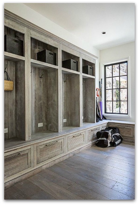
1. mudrooms... It's beautiful, but we don't need a closet that's out in the open.
2. gorgeous built-in command centres/ work stations in the kitchen. Unfortunately, our kitchen isn't designed with this purpose.


3. gallery walls of command centre. These products are beautifully designed, but it looks too busy for my liking.

Pottery Barn
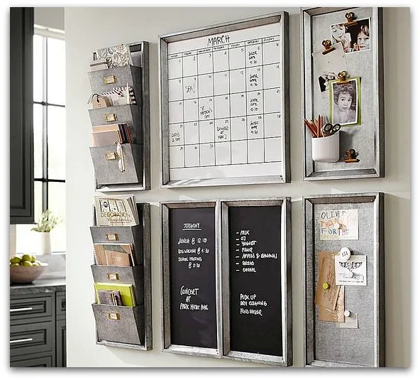
Pottern Barn
My preference is to have our drop zone blend in with our seating area, such that it appears to be more of a decorative element than an actual "drop zone". Most recently, Jen at Rambling Reno also added a drop zone of a similar idea at her new house. I wish we had addressed our need of a drop zone early on like she did when we first moved in.

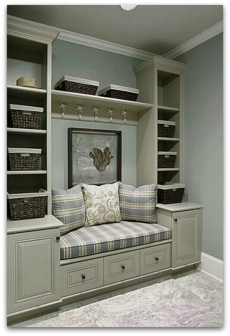
These beautiful inspirations show how drop zones can be functional and beautiful:


Simple, right? It's basically just a dresser, or so I thought. I wanted to limit the depth of the unit to a max of 15", so that it's not in the way of the window by too much. That proved to be a problem in finding a piece at the right size.
Anything that's at around 15" in depth is the height of a side table, which is around 28"-30". That would look too short for our 9' ceiling. I need a piece that's at counter height of 36", but it automatically becomes the depth of a dresser at 18-20". That's too far out for the little nook.
Could it be that a piece that fits our dimensions and budget does not exist? The simplest things are always the hardest to find!
Seems like I've no choice but to add this drop zone unit to the Mr.'s to-build list. Check back soon, as I'll talk about the design of this DIY unit next!