New House Living Room - Design Board
/*** CHECK OUT OUR LIVING ROOM REVEALED HERE! ***
I just love hanging out at the mall these days! All the stores are looking so festive with their Holiday decorations, that sometimes I'm not sure if I'm looking at the products or checking out how they decked the stores. I love decorating for the holidays, but I guess I'll have to skip it this year and save the hassle of going through boxes to find the Holiday accessories.
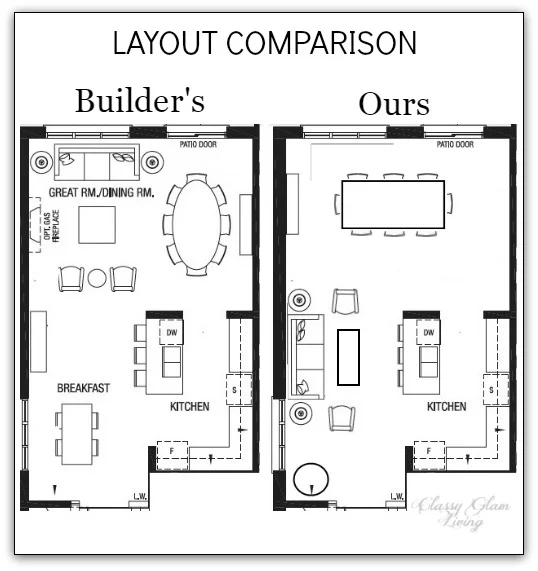
For now, I'll just have to satisfy my craving to decorate for the Holidays by putting together some design boards for our new house. Earlier this week, I shared some inspirations on our living room's furniture placement. We've done some virtual shopping to come up with a design board for it.
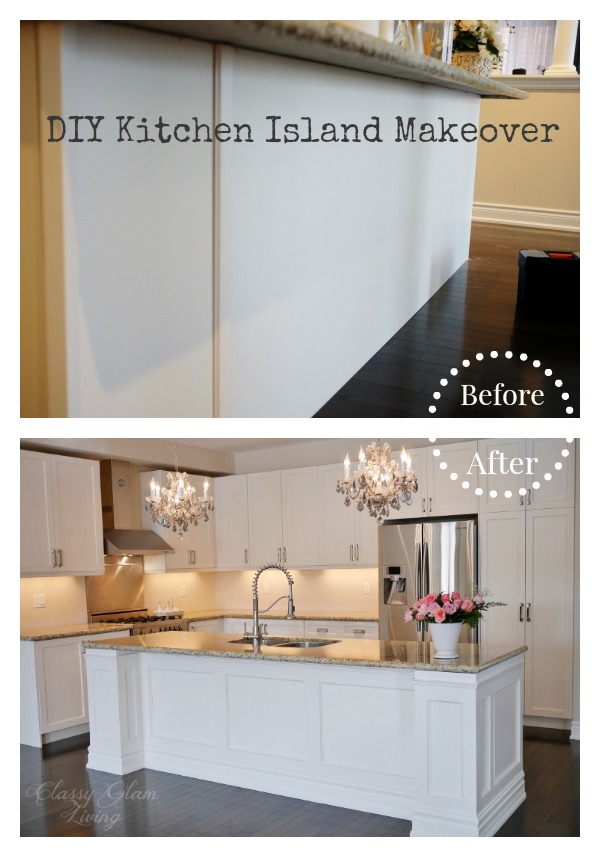
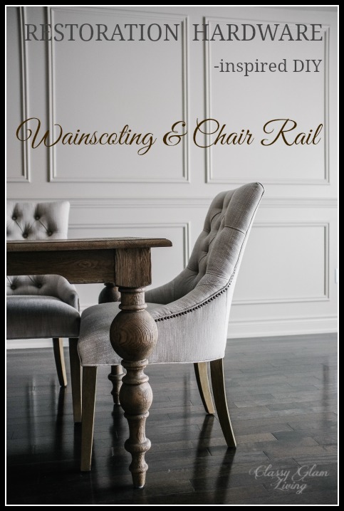
Remember how my Mr. LOVES trims and mouldings projects at our previous house? One of the first projects that the Mr. is longing to start is the wainscoting for our ground floor. This project will be different from our previous dining room trims, as he'll be building out on the wall instead of just adding trims. We'll also ditch the chair rail and have a single pane from floor to ceiling, similar to this but without the gap midway:

image via panellingireland.com
The wainscoting will create depth along the walls of the living and dining areas, and the single pane will help to emphasize the height of the space. I will make sure I take more in-progress photos this time around!
I mentioned in the previous inspiration post that we want the living area to be an elegant, yet somewhat casual sitting area where we can plop down on the couch. PLOP DOWN is the key, so I went in search for a couch with nice lines that looks comfy enough to sleep in! I kept coming back to this one...

DUMONT LINEN SOFA | ONE KINGS LANE
It looks very ordinary, but the indented curve at the arms makes this casual-looking couch more refined. I love a couch with a single seat cushion - it takes the ordinary out of a couch, and nobody has to sit on a crack between seats. The grey piping is also a nice pickup of our grey kitchen cabinet (whichever grey that may happen to be) from just across the living room. Tell me this couch doesn't look comfy enough to nap in!
For our narrow living area, adding a pair of armchairs on either side of the couch will provide more seating when we have guests over. The tufting on this chair exudes a sophisticated air that enhances the elegance of the couch above, and the open arms make it oh-so-welcoming! The grey brings out the grey piping of the cream couch and gives the room some contrasting colours.

Cardiff Tufted Upholstered Armchair | POTTERY BARN
With the living area right off of the pathway next to the kitchen, we decided to go with a coffee table with an open bottom. The wiry legs of this coffee table helps to give an illusion of a wider pathway. The bronze metal colour provides a nice contrast against the cream couch and grey armchair, while the mirror top adds the sparkly element to this otherwise rustic looking piece.

Bliss Studio Arbolo Cocktail Table | LAYLA GRACE
To complete the look of symmetry, we would have a pair of side tables on each side of the couch. It would be a great spot for some knick-knacks and a pair of table lamps for ambiance lighting. A pair of round side tables would lessen the stiffness of the straight edges of the coffee table, We also prefer a more airy piece to balance the chunky armchairs, and this side table below fits the bill.. The deep antiqued gold frame of this side table works well with the dark iron frame of the coffee table.

Clairemont Side Table | CRATE & BARREL
If we have enough space in the living area, these stools would be some nice-to-have extra seating... you know, in case we throw a huge party. The wooden legs add some warm tones to the coolness of cream and grey seating, and are a nice contrast to the metal legs of the tables. The carved detailing on the legs also adds an elegant feel to complete the living area.

Karline Ottoman | JOSS AND MAIN
Here's is a glimpse of the basic pieces mentioned above put together in our living room to-be, in perfect symmetry.

You didn't think I would leave it at this, did you? Well, it's the holiday season, I can't leave the room bare! Let's shop for some accessories!
The floor looks like it can use an area rug. A light coloured rug would liven up this living area against our dark floors.. I especially love this rug, with its silvery blue zebra pattern. It's my subtle take on a daring pattern =)

WILDERNESS RUG | ONE KINGS LANE
Let's continue filling up some empty spots. Artwork on the wall would be a great addition of some much needed patterns. The architectural photographs of Lisa Russo have a neutral hue that works as a nice backdrop for the living area. The stone detailing on this print will accentuate the panelling and mouldings of the space.

We can't miss ambiance lighting to enhance all the details of the living area. This pair of elephant lamps add a bit of whimsy, while playing on the bluish-grey tones found throughout.
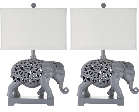
Hathi Table Lamp | JOSS AND MAIN
And there, we've covered a set of basic accessories to dress up our bare living room. Now we can take that up a notch by winterizing the accessories, and jazzing up the space with some simple Holiday decor.

Sources: water colour cushion - Craftberrybush; all other cushions - Indigo; fur throw - Restoration Hardware; faux Holiday arrangement - One Kings Lane; antique brass reindeers - Etsy.
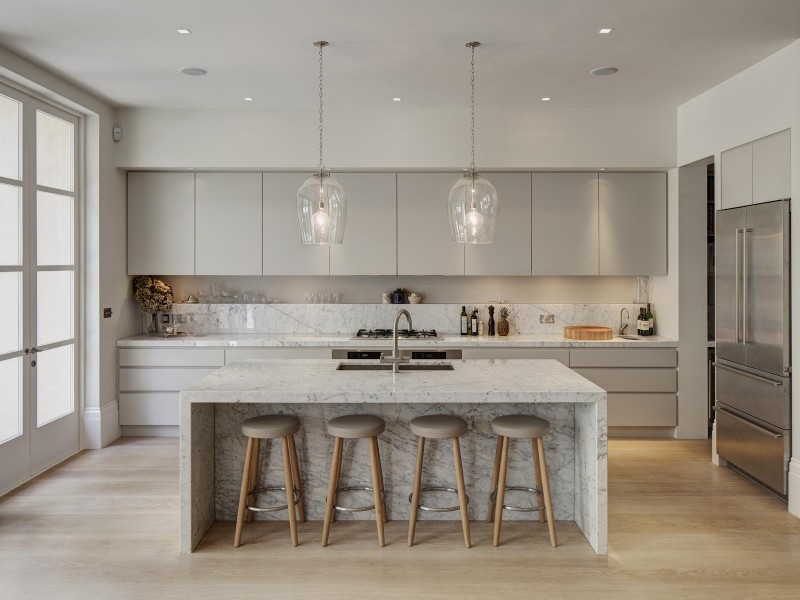
This is the look we hope to achieve for our living area - an inviting tranquil space that will be an elegant focal point through the entryway. By pulling the kitchen cabinet colour to add contrast in the living room, it creates a nice transition between the two spaces that are just across from each other (see layout in previous post). The Mr. said he can be see himself being a happy Chef Honey looking into this space from the kitchen.
For me, I'll just be on the couch, taking a little nap while he's enjoying his new kitchen. Just call me over to do the dishes after you're done cooking up a feast, dear.