Living Room Reveal and Styling Tips
/Being in a townhouse, there usually isn't a separate living room so to speak. Since we had the builder finished the basement as a family room, it freed up space on the main floor (and no TV!). We also didn't need the builder-designated breakfast area, which is in close proximity to the breakfast bar and dining room (c'mon we're only a family of 3). That gave rise to the idea of a seating area in place of the breakfast area.
After months of anticipation, we finally (!!!) received the end tables we ordered back in October for the living room/ seating area. I had decor items lined up for its arrival since our purchase, and we can now focus on beautifying our living room.
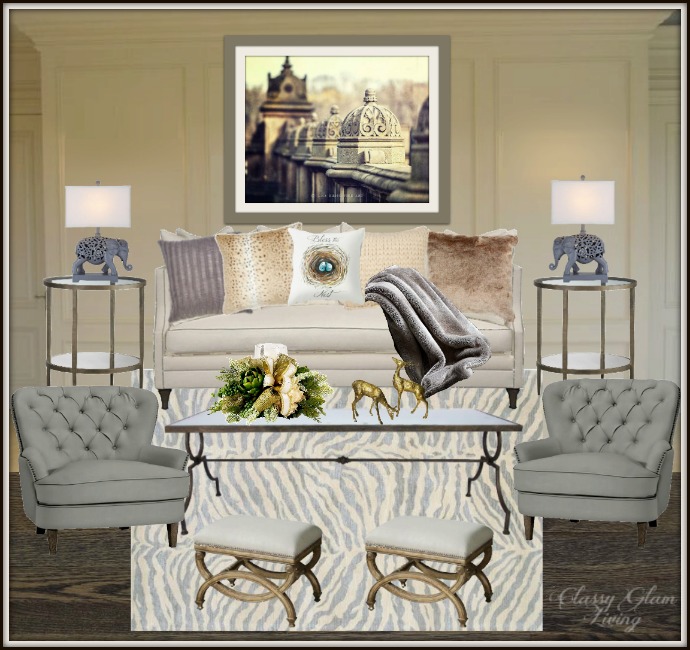
It's been more than a year since I wrote about our living room design board, and this was what I had in mind for our living room in that post:
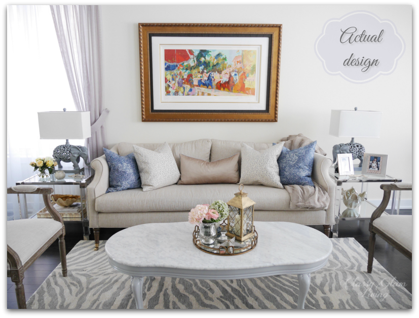
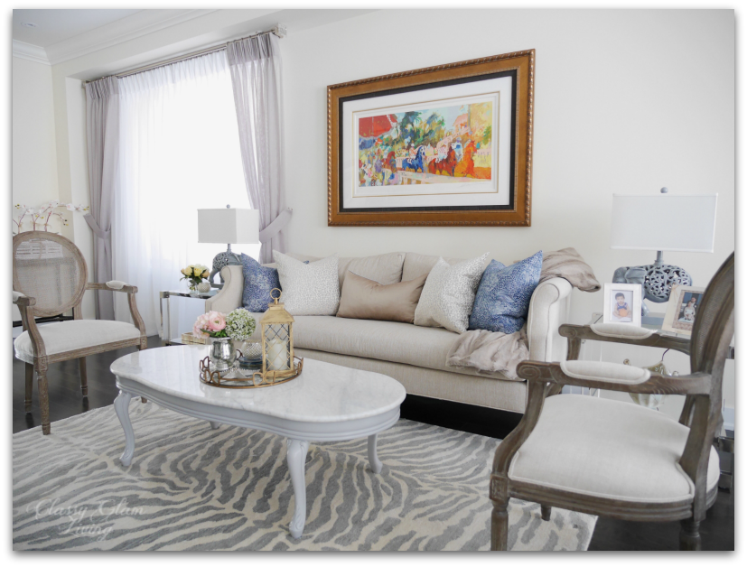
Deals come and go, and so our furniture choices differ from our design board. We incorporated pieces that we love, while still staying true to our decorating style. Here is how our living room actually turned out:
First to set the stage is of course an elegant and comfy sofa. We've scoured through stores, but none other than the Nicole sofa by Sarah Richardson was our one true love. The curvy sides and arms add the touch of uniqueness that distinguishes it from traditional sofas. Plus, I love its large fluffy seat cushion, so nobody would be sitting on cushion gaps.
Natalie Hodgins, who managed our furniture order seamlessly at Sarah Richardson Design, suggested we also include the back cushions. We're so glad we went with her suggestion, the back cushions up the comfy factor of a tight back sofa.
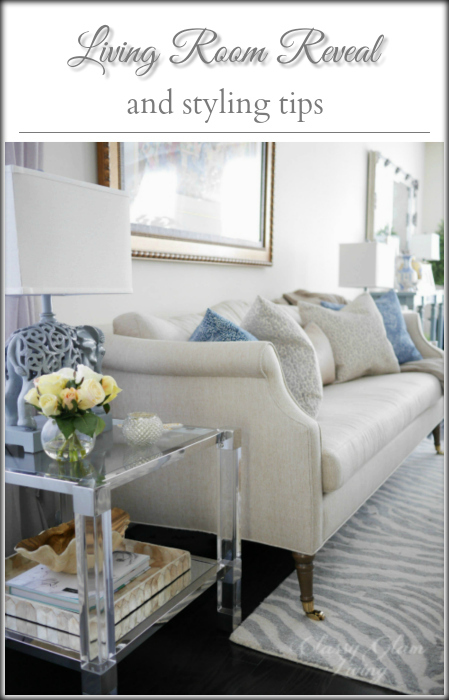
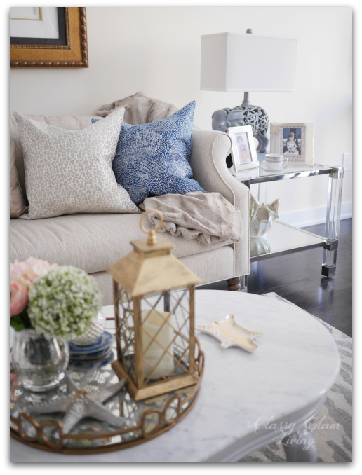
With the statement art piece above the sofa as the focal point, we decided to go with a pair of end tables with acrylic legs. The tables almost seem to disappear into the surrounding, but the chrome accents and mirror bottom shelf bring out the gleam in them.
Its hard lines are a nice contrast to the curvy marble coffee table and delicate arms on the sofa. We also love how the mirrored bottom shelf reflects the light from the table lamps and creates depth for whatever decor placed on it.
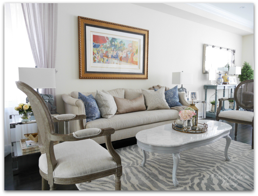
Instead of using large armchairs on either side of the sofa, as in my original design board, we opted to use a pair of cane back dining armchairs from Restoration Hardware. It was one of those decisions that was prompted by a deal, and worked out great in the end. We already had one from our old house's home office, and saw the second one at the RH Outlet while it was running a 30% off lowest ticket price campaign. It was a no brainer to grab it!
Their narrow footprint streamlined the seating area, so that the living room appears less crowded than if we had used chunky armchairs.
With our living and dining areas being next to each other, we used a silvery blue as a transition colour between the two areas. The silvery blue tone can be found in the animal print rug, the kitchen stools, and the dining room console.
It's All in the Details
Now that we have our essential pieces down, it's time to beautify and liven up the seating area with accessories! This is a stark contrast to the year at our rental, which I never bothered to decorate. It was a boring place to stay at, lacking in character without something beautiful to look at.
Since moving in at our new house, I've purged through our old home decor accessories and curated items that we love. I don't really work with a theme, other than a seasonal one. However, the objects still look coherent, because they all represent us.
With a prominent piece of artwork above the sofa, we picked out neutral tones for the throw pillows. Pulling a darker tone from the art, in this case the navy, for a contrasting pillow colour helps to ground the space that would otherwise appear washed out.
We didn't want too many accessories to crowd up the small seating area. Afterall, if I didn't exercise control, I could easily pile up the coffee and end tables with everything I love ;-)
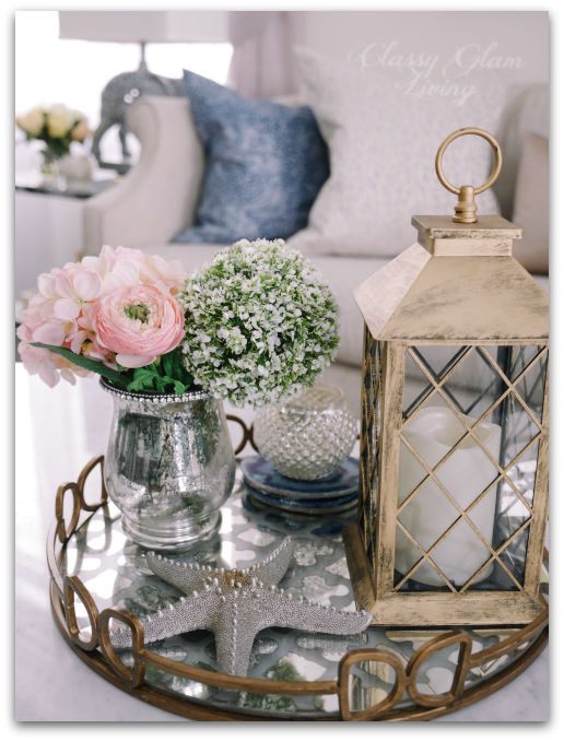
In keeping with the spirit of less-is-more for this small space, instead of filling up the coffee table with books, I decided to give it some breathing space by corralling simple accessories on a tray.
I used metallics throughout to balance the strong copperish gold tone of the frame. It helps to avoid washing out the rest of the seating area against the strong piece of art.
Here on the pale marble coffee table, I used a mirror tray with bronze frame and an antiqued gold lantern:
And at the end table here, with the gold resin shell bowl and beige-gold toned capiz shells tray. I love how the gold Jonathan Adler Carnaby Zebra dish echoes the animal print rug to subtly tie in the accessories.
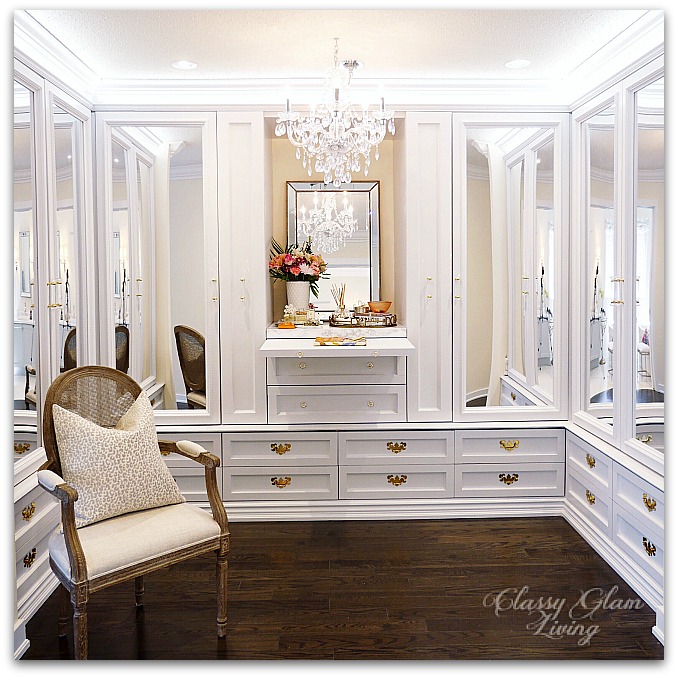
Just in case you're wondering, no, the seating area is not considered done until the Mr. installs the full-panel wainscoting as in my design board. He gave me the "I've got a lot on my plate" look when I reminded him about it the other night. I brought it up, just because... I'll leave him alone for now, as he's still finishing up with our dressing room. =)
It was exciting to envision this builder-designated breakfast area to be a seating area when I first saw the floor plan. Even more fun was the design process, and now furnishing and personalizing it to suit our living style.
We love how it is neutral enough to not fight with the artwork, and yet everything works in harmony. This is the first room that we see when we walk into the living area, and it should naturally feel welcoming. We wanted it to be a focal point without being too formal (ie. realistically livable with a kid).
I think with the speed the little man dashes to the couch after coming home, we've at least managed the livable part =)
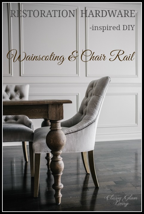
P.S.: The wainscoting should be a piece of cake for the Mr., since he's done the wainscoting with the chair rail for our old house's living/ dining room.

