Our Belated Dining Room Reveal

Dining Room Reveal | Restoration Hardware | Double chandelier, window treatment | Classy Glam Living 1

I just realized the other day, while I was sharing yet again photos of our dining room on Instagram, that I haven't done a proper reveal of it on the blog.  Did you read about our exciting experience at Restoration Hardware's Chicago flagship gallery?  We love the RH style, and this dining table and chairs from RH define our home's overall style.

We're fortunate to have such a large dining area in a townhouse.  Let me explain how we have designed our dining room to be comparable to our previous larger home's.

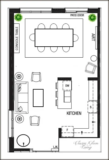
The builder has designated this space as a typical townhouse layout.  As you can see below, the space right outside of the kitchen is the dining area, and the living area on its left.
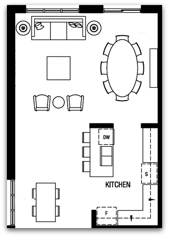
Builder's rendition

Builder's rendition

Ignoring the builder's planned furniture placements, the builder's living/ dining area is a huge open space!  Knowing the dimensions of the layout, I knew it would be a spacious area to use as our dining room. 

But where should we put the living area now that our dining table has taken up the entire space? See the 2 dining tables in the builder's layout?  One is in the dining area and the other in the breakfast nook (bottom left).  We didn't see the need of a breakfast area in our old house, so naturally I've eliminated this one in the new house as well.  As mentioned previously, we designed it as a seating area/ living room instead.  

This was our dining room in our previous home...

DIY wainscoting Dining Room | Restoration Hardware | Classy Glam Living

and I was pretty sure the new house's dining area would fit it just right.

This was the furniture layout we planned for in place of the builder's:

Our planned layout

Our planned layout

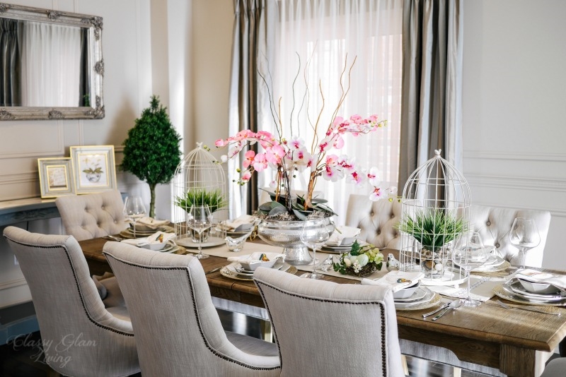
I've posted my dining room inspirations here, and I'm so glad how it turned out!  Although the dining room of our previous home is larger, I love how much brighter the dining area is at this new house.

New House Dining Room | Window treatment, double chandelier, symmetrical design | Restoration Hardware | Classy Glam Living

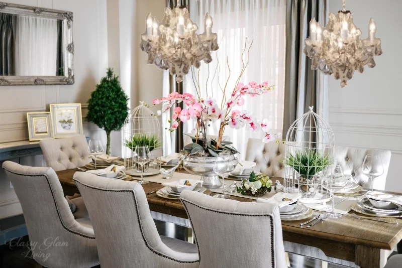
One of the tricky elements of this dining area is the different sizes of windows.  The set of windows on the left is wider than the patio doors on the right.  Since we're using this as a dining area, we wanted the windows to have a unified look.  

We devised a work-around solution to treat it as one large window wall by installing the taupe swags only on either ends of the wall.  This window treatment makes the room feel larger by unifying the two sets of windows as one.  The set of topiaries and the double chandeliers were placed strategically to enhance this illusion of symmetry.

New House Dining Room | French blue console table, double chandelier | Restoration Hardware | Classy Glam Living

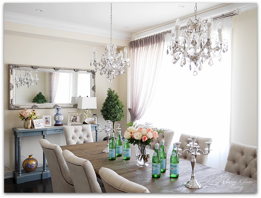
As you can see, the console table is at the same position as in our previous home.  It made sense to have it on the left side of the dining area instead of the right side, which may then block the traffic at the patio door.

These were the chandeliers that hung above our previous home's kitchen island.  We loved them too much and just had to bring them with us to this new house! 

These chandeliers were another tricky point of this dining area.  During our pre-drywall appointment with the builder, we noticed the two light boxes for this space.  They were in the middle of the builder-planned living area and dining area.  If you check the floor plan above, you would notice the lights would be far apart.  

New House Dining Room | double chandelier | Restoration Hardware | Classy Glam Living

We requested the placement of the light boxes in this large space to be moved to accommodate for the two chandeliers.  We marked exactly where the boxes should be.  Although the site supervisor emphasized that he couldn't promise us the location would be exactly as marked, they were pretty much where we wanted them to be...  4 ft. apart above the centre of the dining table.

And yes, to know where to mark those light boxes, we had in mind the placement of our dining room furniture in this space.  We had a rough idea of how far the dining table should be away from the window wall, and how much space should be between the dining table and the console table.  That was how we gauged where the light boxes of the chandeliers should be.  

These are what I would call minor but essential details of our planning phase.

New House Dining Room | French blue console table, double chandelier | Restoration Hardware | Classy Glam Living

And since we don't have a home office, this is where I have my (usually messy) work area as well.  Yup, I use the Mr.'s rock glasses for my fave lemony San Pellegrino.   It makes my water look that much prettier!

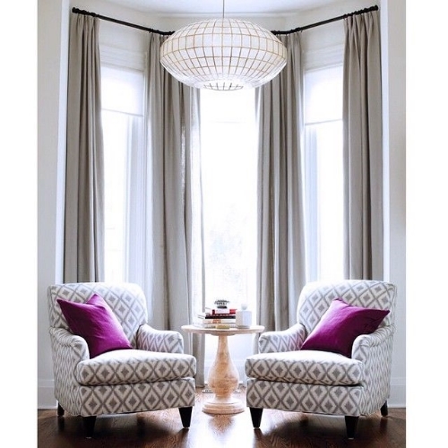
This is the breakfast area turned seating area.  Notice there's no TV on our ground floor.  We've always wanted it that way, even at our previous home.  We're not serious TV watchers and I find it a nuance to work furniture placement around a TV.  Instead, we had banished the TV to our basement family room.  It's a calmer home without having to talk to each other over TV sounds.

New House Dining Room | Living room seating area | French blue console table, double chandelier | Restoration Hardware | Classy Glam Living

The walls look bare without any wall treatments.  Eventually the Mr. will get to building the wainscoting and re-painting our main floor.  I'd much rather have our storage issues addressed before we attempt any improvement projects on aesthetics.  You can see the Mr.'s DIY wainscoting at our previous home's dining room here.

New House Dining Room | French blue console table, double chandelier | Restoration Hardware | Classy Glam Living
New House Dining Room | French blue console table, double chandelier | Restoration Hardware | Classy Glam Living 2

I think I've covered most of the design elements of this dining area in our new house.  Well, it's not so new anymore; I can't believe September would be our first year anniversary at this house!  It's time to celebrate!

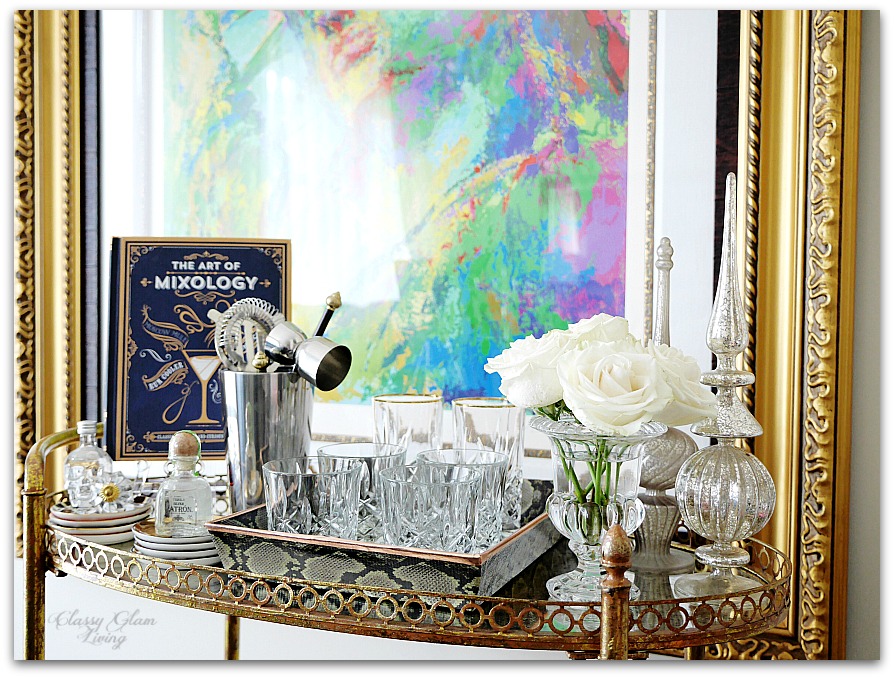
Oh that reminds me of this important part of our dining room...  our bar cart!

New House Dining Room | Elegant bar cart styling | Classy Glam Living
New House Dining Room | Elegant bar cart styling | Classy Glam Living 2

Design Inspirations for Our New Dining Room

Dining Room Design Board | Classy Glam Living

When I saw the most recent sale of Get the Look of Downtown Loft  at One Kings Lane, my heart skipped a beat.  Not because of the items for sale, but the inspirational photos of the living and dining areas show a layout just like that of our new house!  The styling is impeccable - light walls as the background for statement art pieces, an elegantly furnished sitting area, and a traditional dining area with an abundance of natural light.  I think One Kings Lane just read my mind!

I've previously talked about how our living/ dining areas are adjacent to each other.  Here's the design board for our living room.  I'm hoping it'll be be loaded with natural light during the day, just like OKL's photos above.

Here is our furniture plan for the dining area, which is open to the living area, similar to the One Kings Lane photos above.  

Living Dining Layout | Classy Glam Living

The dining area is approximately 18' x 14', so our existing dining furniture will fit in nicely.  The left side of the dining room will look similar to our previous dining room, where the console table and mirror are placed against the wall.

Dining Room Setting | Classy Glam Living

However, not everything decor-wise will remain the same at the new house.  Afterall, moving into another house is the best time to try something new!  

Wall Treatment

The trim-crazy Mr. will no doubt still want to have trims done for the living and dining areas.  This time around, instead of a chair rail separating the upper and lower walls, the wainscoting will be from floor to ceiling.  The chair rail draws the eyes along the walls, and is more approriate for a large space.  With our smaller ground floor at the new house, we want to lead the eyes upwards and that can be achieved by a full floor to ceiling wainscoting.

The style of the wainscoting will be built out, rather than installing rectangular frames on the walls like we did for our previous dining room.  We used a similar built-out effect on our kitchen island.  We like the minimalist look of inset frames, while the architectural detailing still gives the area an elegant feeling.

BUILT-OUT PANELLING - FRAME IS INSET

BUILT-OUT PANELLING - FRAME IS INSET

FINISH LOOK OF BUILT-OUT PANELLING...  JUST IMAGINE THAT ON THE WALLS!

FINISH LOOK OF BUILT-OUT PANELLING...  JUST IMAGINE THAT ON THE WALLS!

WINDOW TREATMENT

With the living and dining areas being open to each other in a smaller area, we would like to go with less heavy fabrics for draperies.  A softer look helps to open up the space, while still looking elegant.  I went from considering the extreme of a sheers-only look...

SOURCE UNKNOWN.

SOURCE UNKNOWN.

... to a sheer on sheer look...

... and then I saw this set of gorgeous linen drapes.  Linen still has the light and airy feeling I'm opting for, but it has a slight weight to it that gathers nicely with French pleats.  Pair the panels with some nice rods, and we've got a winner!

TWO CHANDELIERS ABOVE DINING TABLE

I had been searching for the longest time for the right dining room lighting fixture at our previous house.  At the new house, look no more!  We took our chandeliers above the kitchen island with us, and we'll put up the pair above the dining table!  That'll for sure be a statement piece of jewelry for the dining room!  This is my attempt to visualize the look =)

Dining Room with 2 Chandeliers | Classy Glam Living

STATEMENT ART PIECE

At the right side of the dining room, we're planning to hang a statement art piece that measures around 4'H x 3'W.  We can leave that wall as is, but it will look too bare.  Putting an armchair at the corner with a sidetable would fill up the space nicely, while creating an extra sitting nook...  for someone ready to jump to help with dinner, or someone anxiously waiting to nab at food coming out of the kitchen (aka me)..

BAR CART OR CONSOLE TABLE?

In place of the armchair at the corner, we originally thought that would be an excellent spot for a barcart.  Since we already have a console table, I think making it into a bar area looks just as attractive, similar to this look:

THE DINING RUG

Ahhhhh, the dining room rug.  The search for it seems never-ending.  It's a similar situation as the dining room light fixture.  Getting the bang for the buck on these investment pieces is just not an easy task, not to mention other factors that we need to consider.  From the rug size and style, to practicality like material and pile, it's been a long ride. We prefer rugs with a border, with a muted tone on tone pattern or neutral colours that are subtle against the statement art piece.  In short, we've (finally) narrowed down to these several looks. 

This pretty much wraps up the ground floor design of our new house.  "Small space, big living" is our new motto, and we'll achieve that with practical design of our home.  From our entryway, kitchen, living room, and now the dining room, we want to (and need to) utilize and enjoy all the space available.  We don't have the luxury of extra space for a "display only" living and dining "museum", though we'll design our space with luxurious touches that are also practical for everyday living.  

Practical design is also key when you have a kiddo who grabs any stick-like objects and starts playing floor hockey right then and there...

CAN'T WAIT TO MOVE IN!