Master Suite Series - Master Ensuite
/I've come to realize that getting ready in the mornings with the Mr. is a luxury that I miss from our old house. We were spoiled with double sinks in our previous master ensuite, making it a breeze to share the bathroom in the mornings. Our current bathroom situation at the rental? The master ensuite is a utilitarian space, with a single sink and vanity... do your business, in and out, not a place to linger. The Mr. is letting me have the ensuite to myself, while he preps for his day at the main bathroom, before little man gets up.
The one space I'm lookng forward to most at our new house is, you guessed it, the master ensuite. The new house's master ensuite has a practical layout with features that I love.
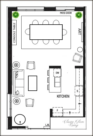
As mentioned before in the first master suite post, an alley separates the closet to the right and ensuite to the left. That makes the ensuite a long rectangular room, and a bit longer than the closet.
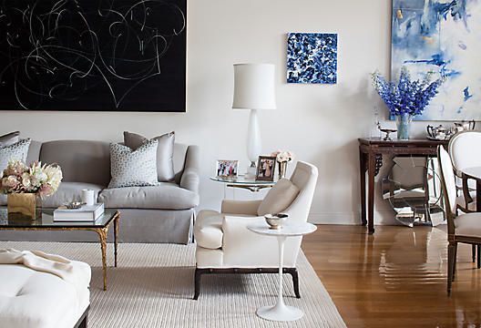
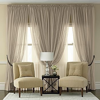
I was actually able to find photos on Pinterest that look similar to our ensuite's layout and size. The entrance to the ensuite faces the double vanity, which is flanked by a stand-alone tub on the right side, with a window facing the tub as such:

And a full length shower to the left end of the ensuite, with a window above the toilet.

Amazing what you can find on Pinterest!
Modern day master ensuite is not only a room for "personal business", but more so a relaxing spa-like space to enjoy. That is my goal to turn this builder ensuite into our sanctuary at a reasonable budget.
The one main change we did for the ensuite was replacing the double swing-in bathroom doors with a pair of pocket doors. I struggled with this change for a while, because I have always envisioned changing out the pair of original solid doors to a pair of beautiful french doors. The brass handles on this pair are simply divine:

Source unknown
But our house has an "open door policy", such that no doors should be left at less than wide opened, for fear of monsters hiding behind the door... (and let me tell you, it wasn't my request nor the little man's). If I've to leave our ensuite doors open flat at all times, then I wouldn't be able to put anything at the walls behind them, losing out on valuable space. After looking at the layout of the ensuite for the millionth time, I checked with the Mr. if he would be open to a set of pocket doors instead.
And he was! Here's a photo of our ensuite taken from the closet across. You can see the framed slots for the pocket doors on either side of the entrance.

With the pocket doors in place, now I can turn the left nook behind the pocket door into a stylish usable space. I can decorate the space with an etagere, or install a train rack on the wall and pair it with a stool.

Etagere mrs. howard personal shopper; train rack restoration hardware; stool union lighting
With the vanity facing the entrance of the ensuite, I wanted it to be a beautiful piece. Here are some of my favourite vanities of different styles:
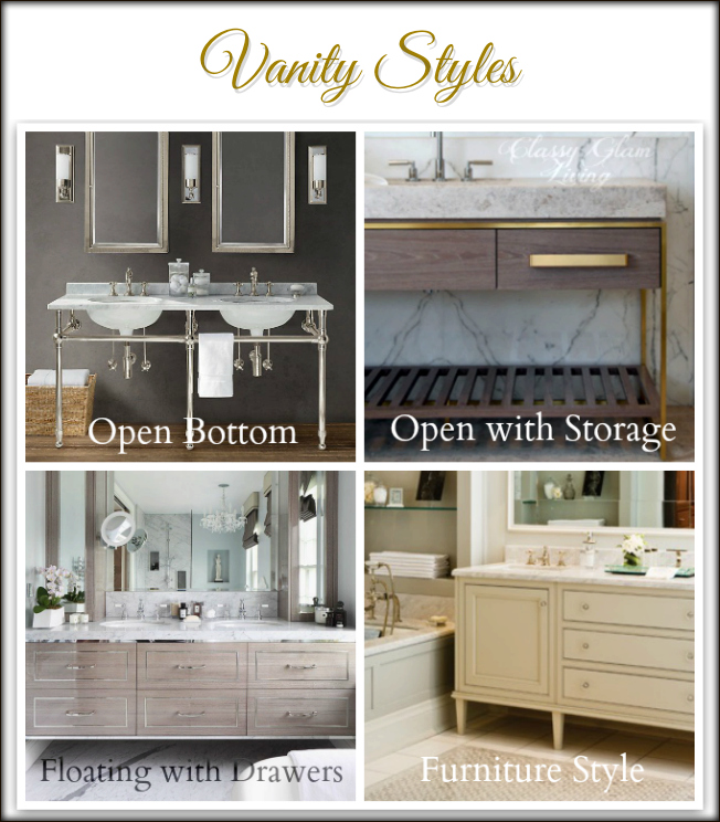
Vanity Styles | Classy Glam Living | clockwise from top right: Belle Vivir, Brian Gluckstein Design; home adore, Restoration Hardware.
As much as we love the open bottom style, we'll have to go with a vanity with storage, since we've made another change to the floor plan to delete the only linen closet in the house. The Mr. doesn't quite like the floating style, so my compromise would be the furniture look. It provides the storage we need, with a slightly open bottom on furniture legs to make the bathroom appear more spacious.
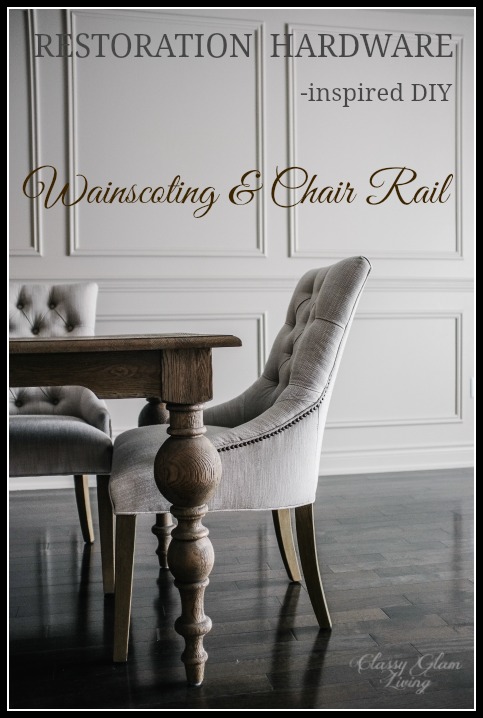
We're installing white glossy floor tiles, so we would go with a grey vanity for some contrast. We asked the builder to install 3 light boxes for our sconces. In place of the builder's large wall mirror, we'll have two individual beaded vanity mirrors. I love a light crisp colour on the walls of the bathroom to add some contrast against all the whites and greys. Last but not least, I think the Mr. would LOVE to add some wainscoting to our bathroom!
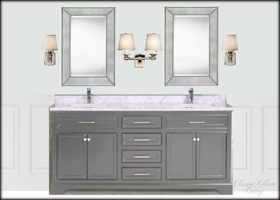
New House Master ensuite design board | vanity view | Classy Glam Living | Sources: Vanity Muti; mirror Home Depot; Single and Double Scounces Restoration Hardware; wall colour Benjamin Moore Marilyn's dress; crop of wainscoting Lowes
Another design feature in our master ensuite is the wall by the free-standing tub. It's like a blank canvas that spans the length of the tub. We can either take the modern route, with bookmatched marble wall as such...

Or a more classic approach, with a marble ledge that is supported by corbels, going across the length of the wall.

New House Master Ensuite | Tub Feature Wall Design | Classy Glam Living | Marble ledge image (VIA); Tub Home Depot; Chandelier feiss; side table Joss & Main; Corbels home depot.
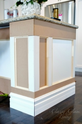
The wainscoting that the Mr. will install would continue to the wall behind the tub as well. A small side table for a drink to enjoy in the soaker tub, dimmed light from the mini crystal chandelier above the tub, would be the perfect ambiance at the end of a day.
I can't wait to plunge into the deep soaker tub in our new master ensuite, and I won't get up even after my skin turns wrinkly like a prune. Afterall, I've waited long enough to enjoy this bathroom! While the Mr. hangs out at his workshop for the numerous projects at the new house, I'll be... right here.