New House Design Board - Entryway
/
Since our move to the current rental, I don't drive by the site of our new house everyday. Not being able to keep an eye on its progress doesn't stop me from longing for its completion! Coming home to a rental, and knowing it's a temporary home, just doesn't feel very homey. I look forward to the day of going home to our new house and be greeted with a welcoming entrance. Let me share with you today what we have done and will do to make our entryway a statement for our home.
The size of the new house's foyer is around half the size of that in our old house, so we had to figure out how to create a welcoming entry that also displays our style in that tight space. We wanted to make the entryway/ hallway as open as possible, so we made some changes to the builder's blueprint.
- Remove the closet at the front door, since there's another smaller one by the garage entrance down the hall.
- The main thing was opening up the whole basement staircase instead of the builder's plan with enclosed stairs via a doorway beside the foyer.
- Remove the full wall beside basement stairs and replace with a structural pole and stair spindles. The foyer would look more continuous this way with the wall knocked out, instead of ending it at the wall.
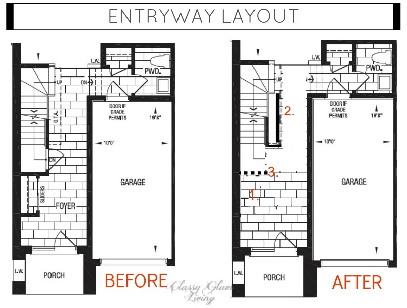
With the changes in place, the squarish foyer now feels much more open. It's also much easier for us to decorate to make it a welcoming space, like how any home's entrway should be.
Remember my beloved blue ceramic trunk table, as decorated like this in our old house's entryway? We can no longer use it at the new house for the same purpose, since it would take up half the foyer! The foyer at the new house is approximately 8' across. To keep a modest walkway from the door through the hallway, I looked for a narrow hall table to be placed on the left wall. I was inspired by these beautiful foyers.

image via Style At Home

image via House & Home
To keep the entryway with an open feel, we opted for a console table instead of a cupboard. I was considering glass console table options, until I saw this.

Troy Console Table \ Joss & Main
Never in a million years would I consider something like this, since the Mr. and I aren't big fans of mixing wood and metal on a piece. But somehow this seems to work. Its wooden top mimics the rustic touch of our existing dining table, while the gold metal legs give it a more polished look. I think this piece makes a great addition to our home, as I believe the entryway should project a style of what's to come in the rest of the house. For us, it's a bit of polished casualness… does that make sense?!
The next integral piece of this entryway vignette would be a generous sized mirror. Don't know about you, but mirror shopping can sometimes be daunting. After a while, they all look pretty much the same. There're some mirrors that at first seemed to be a great touch when used by a designer, and then we would start seeing the same style of mirror mass produced and over-used for a thousand times. If you scroll through my Entryway Pinterest board, you would notice I've pinned numerous mirrors. But none screams to me except for this:
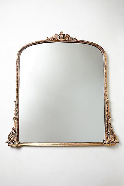
Gleaming Primrose Mirror | Anthropologie
This mirror with a delicate iron frame (not resin!) is regal yet understated. The style of the frame elevates the flare in the casual console table. At just over 3' high and across, it's the perfect size to complement the console table and draw attention to our 9' high ceiling. I'm so in love with this mirror. Do you think there's any chance this will be on sale? Ever?
Another important piece in our previous home's entryway was the tufted bench. Again, given the smaller foyer in our new house, we better not stuff the bench there and create a fire hazaard! Once you've had a seat in the foyer, you won't do without one. And so the hunt for our entryway seating begins!
Since a large bench doesn't fit in the space, it's time to switch to a chair. Essentially, I'm looking for an accent chair that's the size of a dining chair. Here are some examples:

1. Claire Tufted Chair | One Kings Lane; 2. Olivia Slipper Chair | One Kings Lane; 3. Faux Bamboo Chair | Maggie G Designs
I wanted the console table vignette to be the focal point of the entryway, so I chose a light neutral fabric colour for our chair choices. Although I would have the chair blend in as a background, I would still want the chair to be visible to act as a visual extension of the console table. That being said, #2 would have to be eliminated, as it's lower than the height of the console. Another reason for it to go is, the Mr. always prefers a chair with arms over one without. #1 and #3 both have a very welcoming feel to them, and I love the chippendale style of #3. However, with the point of the chair being more blended into the entire console table vignette, I would pick #1 over #3, to avoid the tonal contrast of the dark chair frame.
Now that I've the basic pieces down, here's the fun part - accessorizing the space! Lighting plays a big part in a room's ambiance, and that's especially true for the entrway. We want to create a bright and welcoming entrance, and one can never go wrong with bling bling. I think this chandelier hits all the right notes. It's an appropriate size for the space, and its antiqued silver finish tones down the shiny metal, letting the jewels speak for themselves.

Veronica Mini Chandelier | Joss & Main
We love classic blue and white decor, as in the photo inspiration above. This rug below would ground the space nicely with the navy blue pattern and provide some contrast to the entryway vignette.
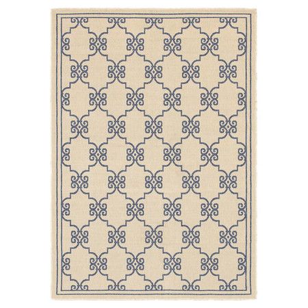
Barrington Rug | Joss & Main
From the rug, I came up with the rest of accessories for the entryway vignette, by running through my usual vignette setting guidelines found here. Blue and white boxes for hidden knick-knacks with a lamp to soften any harsh overhead light. A chinoiserie pot of tall arrangement on the round mirror tray, which offsets the straight lines of the console table. A rose coloured bowl for an unexpected touch of colour and something to just toss in whatever as we walk through the front door. Here's my idea of how it would look as you face the left wall of the entryway, with the armchair beside the railings to the basement.
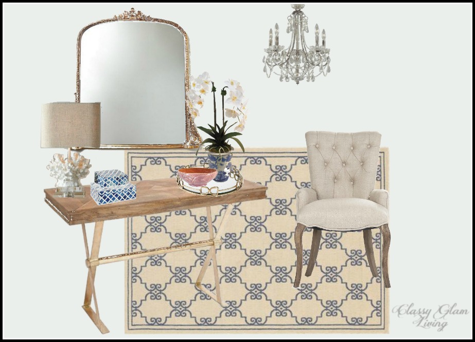
Entryway Design Board | Classy Glam Living; Lamp Horchow; blue and white boxes, mirror tray, faux orchid arrangement, rose compote | One Kings Lane.
I CAN'T wait to come home to this!!
What do you think makes an entryway most welcoming? I'm thinking of adding a tall floor plant or an umbrella stand to the left of the console table. Let me know if you have any other ideas!
Disclaimer: The reveal of the entryway may differ somewhat. Who knows, maybe I would entertain a real orchid plant for once, but who am I kidding... I'm a plant murderer.