Drop Zone Unit - Design Board

I left off my previous post with the difficulty I had in finding the right storage unit for our drop zone, and our most feasible option would be to DIY a unit from scratch.  I'm confident it shouldn't be a problem for the Mr.; you can check out his previous builds here

The Mr. doesn't take on a build lightly.  I had to show him that I had at least tried to shop around for a unit, but my options are constrained by size and budget.   I really wanted this storage unit to blend in with the existing style of our main floor, and the elegant look of these mirrored cabinets are exactly what I'm after. 

All from Wayfair

All from Wayfair

However, as mentioned in my previous post, these are around 28-32" high, which I think is a bit too low for the 9' ceiling.  I also prefer to have all drawers, so I turned to dressers with drawers instead.

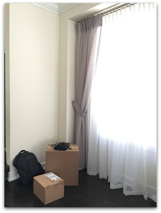
Unfortunately, dressers are usually 18-20" in depth, which would be too deep for that little nook by the window.  I wanted to keep the depth at a maximum of 15", so that the storage unit doesn't protrude too much beside the window.  See the nook right by the window, our current drop zone:

Drop zone makeover | Classy Glam Living

And that was when I turned to my last resort...  I made a MAYDAY request to the Mr. to PLEASE build a 3-drawer unit for our main floor's storage!!  Thankfully, he's all game to build another piece of DIY furniture 😁

The pros with going DIY custom route are:  1. it would be in the exact dimensions for the nook, 2. done at a fraction of the price of an actual furniture piece (if I could even find one).  The cons?  Well, it'll have to wait for the Mr.'s availability...  when the hockey season is over and he is free from his coaching and chauffeuring responsibilities.  

I was so excited for another DIY furniture piece and immediately went on Pinterest to check out design inspirations!

Design Inspirations

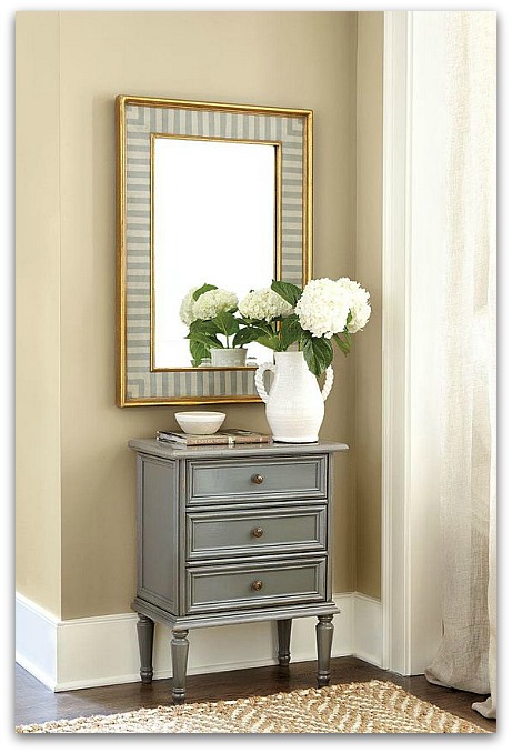
The colour combination of this unit was my jumping off point.  I love the grey unit with gold hardware.  It'll tie in with our kitchen decor!

This is such a beautiful piece from Ethan Allen.  The details surrounding the drawers and the legs are absolutely gorgeous.  Those ring pulls also reminded me of a set that the Mr. loves (more on that below).

The side profile of this unit highlights the elegance of this unit.  The top and bottom rounded edges give this unit a sophisticated touch.

Yes, I know this is a vanity, but the design is totally "buildable" by the Mr.!  I'm loving the frame at the face of the unit, enclosing the drawers.  

Hayburn & Co

Hayburn & Co

Combining the above design elements, can you imagine the finished product with this lion ring pull (the Mr.'s most favourite hardware ever)...

with these legs...

Or are you a visual person like the Mr.?  Well, here's a summary design board I made for him:

Drop zone unit design board | Classy Glam Living

I just can't wait for hockey season to be over, so that the Mr. can start on this project!  I see a light at the end of the tunnel; the day is near when our clutter will have a home!

We Need a Drop Zone!!! + Design Inspirations

This past weekend's gorgeous Spring-like weather has put me into cleaning mode.  But just like how this Spring tease won't stick around for long, neither would this "cleanliness" at our home.  The one main culprit is CLUTTER.  

Mail, papers, homeless decor items...

Mail, papers, homeless decor items...

One thing I'm not diligent with is dealing with all the papers that come through our door.  No matter how much I try to cut down on our paper trail, some are still inevitable.  At times (actually, most of the time), our dining table is a dumping ground for piles of papers and homeless decor items.  On the rare occasion that it's cleared off, I snap a photo for Instagram:

Dining Room | Classy Glam Living

It all comes down to the fact that I'm just not a good cleaner-upper.  Our main floor has no closed storage at all, except for our kitchen and cloak closet.  As much as I want to hide my keys and mail in a kitchen cupboard, it just doesn't make sense (and I better not start with that habit!).  I desperately need a place to temporarily put away these things!

What I need is a drop zone/ storage/ command centre by the entrance.  A designated spot where I can drop off my keys/ sunglasses as I walk through the door and hide the mail that I'll eventually attend to.  A place where I can store papers temporarily until I file/ shred them, and where I can have a simple filing system for our family.

At the home office of our old house, the lower right cabinet of this DIY built-in unit was my drop zone.  It wasn't ideal, since the office was on the second floor, and I just didn't drop off the stuff in there often enough...  ie. the stuff would linger on our kitchen counter back then.

Home office | Classy Glam Living

At our current house, there's a perfect spot for a multi-purpose drop zone right by our garage entrance.  It's an empty corner beside our seating area; a space that's only 32" wide, where we put out our Christmas tree.

Our designated drop zone

Our designated drop zone

When it's not Christmas time, it's literally a drop zone...

It's a drop zone in reality, and I hate it.

It's a drop zone in reality, and I hate it.

So, as usual, I flipped through Pinterest for design inspirations to make this little space of our main floor more functional and presentable.  What I get are very out-in-the-open, in-your-face kind of drop zones/ command centres.  I see designs of...

1. mudrooms...  It's beautiful, but we don't need a closet that's out in the open.  

2. gorgeous built-in command centres/ work stations in the kitchen.  Unfortunately, our kitchen isn't designed with this purpose.

Drop zone inspirations | kitchen work station | Classy Glam Living

3. gallery walls of command centre.  These products are beautifully designed, but it looks too busy for my liking.

Pottery Barn

Pottery Barn

Pottern Barn

Pottern Barn

My preference is to have our drop zone blend in with our seating area, such that it appears to be more of a decorative element than an actual "drop zone".  Most recently, Jen at Rambling Reno also added a drop zone of a similar idea at her new house.  I wish we had addressed our need of a drop zone early on like she did when we first moved in.  

These beautiful inspirations show how drop zones can be functional and beautiful:

Simple, right?  It's basically just a dresser, or so I thought.  I wanted to limit the depth of the unit to a max of 15", so that it's not in the way of the window by too much.  That proved to be a problem in finding a piece at the right size.  

Anything that's at around 15" in depth is the height of a side table, which is around 28"-30".  That would look too short for our 9' ceiling.  I need a piece that's at counter height of 36", but it automatically becomes the depth of a dresser at 18-20".  That's too far out for the little nook.  

Could it be that a piece that fits our dimensions and budget does not exist?  The simplest things are always the hardest to find!

Seems like I've no choice but to add this drop zone unit to the Mr.'s to-build list.  Check back soon, as I'll talk about the design of this DIY unit next!

Easiest Steps to Edit Brighter Interior Shots for Instagram - My Recipe

Easiest Steps to edit brighter interior shots for Instagram.jpg

A new year brings the urge to start anew by purging.  My own Instagram (IG) feed gets the same purging treatment.  As I went through my earlier photos on IG, I noticed how the photos have evolved.  It has definitely been a learning process.  From photo composition, to styling a space, to cropping a photo to hide unsightly cables (as most I could), Instagram has been a fun ride and I'm still learning lots from my fellow interiors enthusiasts!

Now that I'm not limited to taking photos at night with incandescent lighting, the photo quality has definitely benefited from more daylight shots.  Ideally, I would be taking photos at the time of day when the room has the most natural light.  Of course, this ideal situation rarely exists.  So, I started to experiment with photo editing apps.  

I apologize to have deceived you that our house is filled with an abundance of beautiful sunlight...  well, at times it does, depending on the time of day.  But sometimes it's just impossible to shoot with bright daylight, when we're experiencing a string of gloomy winter days.  This is when these photo editing steps would really come in handy.

Easiest Steps to edit brighter interior shots for Instagram.jpg - 1

I want to share with you these easy photo editing steps that will help your photos appear even more beautiful on your followers' feeds.

Disclaimer:  I'm not a professional photographer, nor a graphic designer.  I rarely take photos with a tripod (ya, and I'm an interiors blogger!).  This is not a tutorial on how to take nice photos, but a post-editing method that works for me.  Although I know the camera settings, sometimes I just want to turn the camera on and snap a photo, enhance my photo in seconds and upload it to Instagram.  (This post is NOT sponsored by the apps mentioned).

My goal is to enhance my original photo to be brighter, sharper, and yet still appear natural and untouched.

First and foremost, learn your own shooting style and start with a well-composed shot.  Secondly, try to take the initial shot as straight as you can (using the camera's on-screen level), or straighten the photo as the first step of editing.  

Just as importantly, since you're using phone apps for editing, make sure your phone's screen brightness is set to its brightest before you start editing photos.  If your screen's brightness isn't at its brightest, you may over-compensate the brightness, making the photo extra bright.

Without further ado, these are the steps that I go through before I post on IG.  They may seem lengthy, but it only takes me seconds now that I've got the hang of it.

Here's the original version of this interior shot:

Easiest Steps to edit brighter interior shots for Instagram.jpg - 2

It wasn't a particularly gloomy day, but the lighting from the window behind the sidetable made my shot appeared gloomy.  I opted to take the photo without cranking up the exposure compensation too high to avoid washing out the light at the window.

PRIMARY EDITING WITH A COLOR STORY

A Color Story is my favourite photo-editing app for interior photos.  It's an awesome free app that's user-friendly and comes with filters that suits my needs without resorting to in-app purchased ones.  Just like dirty laundry, I like the whites in the photos to appear white, not a light grey nor tinted.  A Color Story does just that, brightens and whitens photos amazingly!

Once I've selected a photo for editing in A Color Story, I usually up the exposure for the photo.  The quickest way to do that on the app is by going to Tools > Adjust > Curves.

Easiest Steps to edit brighter interior shots for Instagram.jpg - 3

Then just drag the middle dot out to the left slightly, until you're satisfied with the brightness.  I usually drag it to a point until the objects look like the photo was shot in good light.  Tap on the check mark after you're done with this step.

Easiest Steps to edit brighter interior shots for Instagram.jpg - 4

Next up, we go back out to the main menu to access the filters.  I found the ESSENTIALS > EVERYDAY filter to look most natural for interiors.  It brightens the photo and increases the contrast.

I usually choose a setting somewhere in the middle of the filter meter to avoid over-exposure and washing out the details of the photo.

Easiest Steps to edit brighter interior shots for Instagram.jpg - 5

Click DONE, then SAVE & FINISH.  

Easiest Steps to edit brighter interior shots for Instagram.jpg - 6

That's right, the photo looks a lot better than its original version already.  You can tell the white is now whiter, and the reflections from the accessories are shinier.  I used to just leave it as is and then would go ahead to post on Instagram.  

However, your photo can still appear better on Instagram!  Here are a few more finger-sliding edits that I would attempt at before the final posting.

SECONDARY EDITING ON INSTAGRAM

I don't use any of the filters on Instagram...  they just never seem natural for interior shots.  But their built-in editing features are great for interiors.  I go in the order from left to right, from Brightness, Contrast, Structure, and to Sharpen.

Start by accessing the editing tools:

Easiest Steps to edit brighter interior shots for Instagram.jpg - 7

1. Brightness

Increasing the brightness just a tad more (I usually go to at least 10) gives the impression that the photo was taken with beautiful daylight.  For this photo, I went to 14, and well, we all know this photo didn't start off like this:

Easiest Steps to edit brighter interior shots for Instagram.jpg - 8

2. Contrast

Adding brightness to the photo would wash out some details, so I would bring up the contrast to balance the brightness.  Around 10 would be a good point.

Easiest Steps to edit brighter interior shots for Instagram.jpg - 9

3. Structure

I love this editing tool, which gives some clarity to textures in the photo, making the objects appear less flat.  I usually go up to 15, anything beyond that would make the photo seem too harsh.

Easiest Steps to edit brighter interior shots for Instagram.jpg - 10

4. Sharpen

The sharpening tool is what makes everything pop in your photo, giving it a crisp finish.  For me, the magic number seems to be 27.

Easiest Steps to edit brighter interior shots for Instagram.jpg - 11

These are the 4 edits that I use every time before I post.  I would occasionally touch on some others, like Highlights, Shadow, and Saturation.  It all depends on the photo quality and the enhancements it needs. 

And that's it!  Now you can add your hashtags and post!

Here's a summary of the progression using the editing steps above:

Easiest Steps to edit brighter interior shots for Instagram.jpg - 12

This is the enlarged final Instagram version that I posted:

Easiest Steps to edit brighter interior shots for Instagram.jpg -13

It might've seemed like a long process.  But it takes less than a minute for me to do all the editing involved.  To get an equivalent shot, I would need to set up my tripod, since my camera would have to be out of my shaking hands and be still to capture an equivalent amount of light for a sharp shot.  Again, I'm not a professional photographer...

Here are several more photos that went from drab to a bit more fab...

Original version of these white roses on our coffee table:

Easiest Steps to edit brighter interior shots for Instagram.jpg - 14

Editing with A Color Story using the same steps mentioned above:

Easiest Steps to edit brighter interior shots for Instagram.jpg - 15

Final editing on Instagram, adjusting parameters mentioned above:

Easiest Steps to edit brighter interior shots for Instagram.jpg - 16
Easiest Steps to edit brighter interior shots for Instagram.jpg - 17

Final product:

Easiest Steps to edit brighter interior shots for Instagram.jpg - 18

Here's the original version of our bar cart photo.  Taken on a gloomy day with my shaky hands...

Easiest Steps to edit brighter interior shots for Instagram.jpg - 19

First edit in A Color Story:

Easiest Steps to edit brighter interior shots for Instagram.jpg - 20

Final edits in Instagram:

Easiest Steps to edit brighter interior shots for Instagram.jpg - 21
Easiest Steps to edit brighter interior shots for Instagram.jpg - 22

Final product:

Easiest Steps to edit brighter interior shots for Instagram.jpg - 23

Another favourite photo of mine, our coffee table mirror tray adorned with freesias:

Easiest Steps to edit brighter interior shots for Instagram.jpg - 24

Final product posted on Instagram:

Easiest Steps to edit brighter interior shots for Instagram.jpg - 25

Here's a photo of the largest white flowers vs. the tiniest, Hydrangeas vs. Angel's breath:

Easiest Steps to edit brighter interior shots for Instagram.jpg - 26

Final product:

Easiest Steps to edit brighter interior shots for Instagram.jpg - 27

I feel like a magician who has just divulged secrets of the trade.  I hope I'm forgiven for deceiving you with the bright photos you see on my Instagram feed by sharing these editing tips with you.  They're super easy, so do try them out and play around with the steps! 

I actually do enjoy the editing process as much as taking photos around the house.  It's almost an art form in itself.  Just remember the goal is to enhance the photo to bring out its positives, while still looking natural.  Hope this post will help you in your IG journey!

What are some of your favourite photo editing apps?  Do share in the comments section!