Master Bedroom Chandelier Straight from the Fairytales

Seems like we're always pushing projects for the master bedroom until the rest of the house is done up. As we near the end of winter (hopefully) and putting its darkness behind us, I guess it's only fitting that it's about time we bring back some light for our master bedroom.  What happened to our light?  Read on...

It all began with an unplanned trip to a lighting store, with no expectations in mind, just to check out some lighting styles and prices.  And you know how it is, you always end up walking out with something when you weren't looking to make any purchases. 

We walked to the chandeliers section of the store, and how can you not be drawn in by all that bling?  Mind over matter, mind over… wow, that looks gorgeous! Is that a red tag? Matter won. 

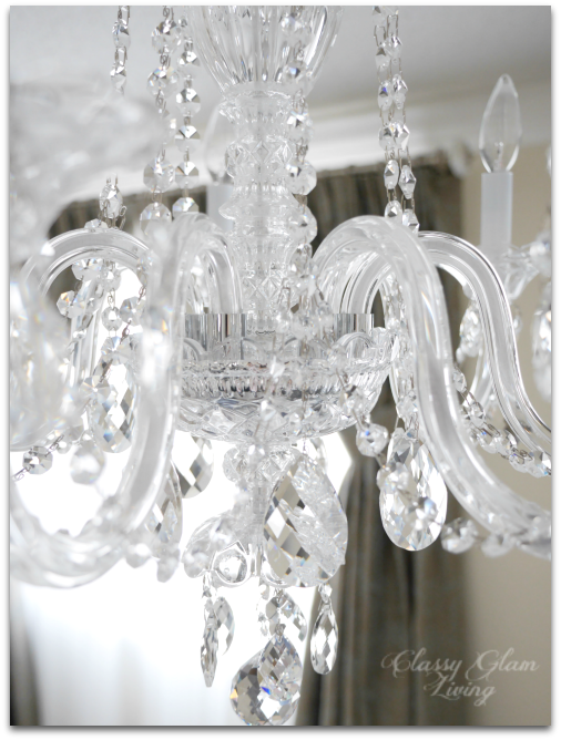
Out of the hundreds of lights and chandeliers at the store, this Schonbek (and the red tag) won us over. Its intricate crystals trimmings are absolutely stunning. Each piece of crystal dangling off of it is carefully positioned for maximum oomph factor. We both knew we've found THE ONE... cue heavenly angels "ah~~~".

Here's a photo of it without the silk shade.

via Schonbek

The grandeur of its style and size is exactly what I wished for as the focal point of our master bedroom as we walk through that long alley that separates the dressing nook and the ensuite.  At about 2-ft all around, it's the perfect size and proportion for our bedroom (see design board).  

I just checked my Instagram photo of this chandelier, and it was 45 weeks ago that we bought this light. It's been sitting in its box for that long. We've moved in for more than 5 months now, but as you know, the Mr. has been busy with building our dressing room.

Master bedroom chandelier | Close up Schonbek 2995 | Classy Glam Living

It's not that he hasn't attempted to put this chandelier up. One day while installing other lights around our new house, he thought he "might as well" put up this Schonbek. He removed the builder's boob light in our room, wires hanging out from the light box and all. He opened the Schonbek, shuffled around the box, cursed, and closed it.  

I looked at him "what the?!" as he put the wire nuts on the wires and shoved them back up in the light box. He said the arms of the Schonbek are not wired to the body.  Being busy with the closet and the side projects (this and this) I've thrown at him, he didn't want to deal with this yet.  Totally understandable...

And that was how we've had no ceiling fixture in our bedroom ever since (thank goodness for our bedside table lamps). 

Master bedroom chandelier | Schonbek 2995 closeup | Classy Glam Living

But that was until this past weekend, when the spring-like temperature reminded me of the longer days, and my mind jumps like it does, I (ie. The Mr.) NEED TO PUT UP THAT SCHONBEK!

I opened up that box that was collecting dust, shuffled around, cursed… AND then checked the almighty YouTube in the hopes to find some kind of assembly instructions.   

Found it!   I was entrusted by the Mr. to wire each arm of the chandelier to the centre column.  We've never had to do this with the other chandeliers in our house, so it was a first for us, and for me!  But it wasn't hard at all, I followed the video to a T.

And here it is, in all its naked glory.  My photos don't do it justice, it's hard to capture the spectral colours reflected by the crystals.  Our eyes just naturally get drawn to its beauty and spectrum of light.

Master bedroom chandelier | Schonbek 2995 | Classy Glam Living

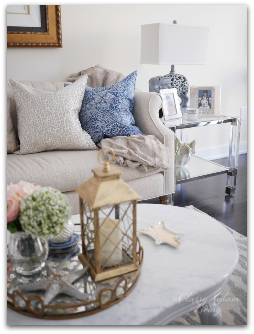
This is the view as you walk in to the bedroom area from the alley.  The right side of the room will eventually be the seating area.

The opulence of the chandelier also complements our sumptuous tufted headboard like they belong together.  Those side tables were the ones the Mr. refinished with love while we were still waiting at our rental to move into this house.

Master bedroom chandelier | Schonbek 2995 Tufted headboard mirror trim | Classy Glam Living

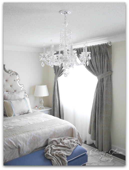
We also got the silk shade for the chandelier to visually increase the size.  Its soft oyster colour can complement any decor or future wall colour we may use, and it doesn't cover too much of the crystal trimmings at the bottom of the chandelier.  

Master bedroom chandelier | Schonbek 2995 with silk shade | Classy Glam Living

The drapes are an integral part of this whole package.  They're gathered like ball gowns to act as a dramatic backdrop for the chandelier as seen from down the hall.  

6 shade wall to wall.png
Master bedroom chandelier | Schonbek 2995 with silk shade.  Turfted headboard with mirror trim | Classy Glam Living
Master bedroom chandelier | Schonbek 2995 with silk shade | Classy Glam Living

We'll eventually give this room a fresh coat of paint (and maybe some wainscoting) and set up the seating area on the opposite wall.  Until then, we'll be happily mesmerized by our newly installed chandelier, straight from the fairytales.

Living Room Reveal and Styling Tips

Living Room Reveal + Styling Tips | Classy Glam Living

Being in a townhouse, there usually isn't a separate living room so to speak.  Since we had the builder finished the basement as a family room, it freed up space on the main floor (and no TV!).  We also didn't need the builder-designated breakfast area, which is in close proximity to the breakfast bar and dining room (c'mon we're only a family of 3).  That gave rise to the idea of a seating area in place of the breakfast area.

After months of anticipation, we finally (!!!) received the end tables we ordered back in October for the living room/ seating area.  I had decor items lined up for its arrival since our purchase, and we can now focus on beautifying our living room.  

It's been more than a year since I wrote about our living room design board, and this was what I had in mind for our living room in that post:

New House Living Room Design Board Christmas Decor | Classy Glam Living

Deals come and go, and so our furniture choices differ from our design board.  We incorporated pieces that we love, while still staying true to our decorating style.  Here is how our living room actually turned out:

Living room reveal + styling tips | Actual design | Classy Glam Living

First to set the stage is of course an elegant and comfy sofa.  We've scoured through stores, but none other than the Nicole sofa by Sarah Richardson was our one true love.  The curvy sides and arms add the touch of uniqueness that distinguishes it from traditional sofas.  Plus, I love its large fluffy seat cushion, so nobody would be sitting on cushion gaps.  

Natalie Hodgins, who managed our furniture order seamlessly at Sarah Richardson Design, suggested we also include the back cushions.  We're so glad we went with her suggestion, the back cushions up the comfy factor of a tight back sofa.

With the statement art piece above the sofa as the focal point, we decided to go with a pair of end tables with acrylic legs.  The tables almost seem to disappear into the surrounding, but the chrome accents and mirror bottom shelf bring out the gleam in them.  

Furniture placement | Living room reveal + styling tips | Classy Glam Living

Its hard lines are a nice contrast to the curvy marble coffee table and delicate arms on the sofa.  We also love how the mirrored bottom shelf reflects the light from the table lamps and creates depth for whatever decor placed on it. 

Living room reveal + styling tips | Classy Glam Living
Acrylic end tables | Living room reveal + styling tips | Classy Glam Living

Instead of using large armchairs on either side of the sofa, as in my original design board, we opted to use a pair of cane back dining armchairs from Restoration Hardware.  It was one of those decisions that was prompted by a deal, and worked out great in the end.   We already had one from our old house's home office, and saw the second one at the RH Outlet while it was running a 30% off lowest ticket price campaign.  It was a no brainer to grab it!  

Their narrow footprint streamlined the seating area, so that the living room appears less crowded than if we had used chunky armchairs. 

Furniture placement | Living room reveal + styling tips | Classy Glam Living

With our living and dining areas being next to each other, we used a silvery blue as a transition colour between the two areas.  The silvery blue tone can be found in the animal print rug, the kitchen stools, and the dining room console.  

Furniture placement | Transitional colour | Living room reveal + styling tips | Classy Glam Living

It's All in the Details

Now that we have our essential pieces down, it's time to beautify and liven up the seating area with accessories!  This is a stark contrast to the year at our rental, which I never bothered to decorate.  It was a boring place to stay at, lacking in character without something beautiful to look at.  

Since moving in at our new house, I've purged through our old home decor accessories and curated items that we love.  I don't really work with a theme, other than a seasonal one.  However, the objects still look coherent, because they all represent us.

With a prominent piece of artwork above the sofa, we picked out neutral tones for the throw pillows.  Pulling a darker tone from the art, in this case the navy, for a contrasting pillow colour helps to ground the space that would otherwise appear washed out.

Furniture placement | Living room reveal + styling tips | Classy Glam Living

We didn't want too many accessories to crowd up the small seating area.  Afterall, if I didn't exercise control, I could easily pile up the coffee and end tables with everything I love ;-)  

In keeping with the spirit of less-is-more for this small space, instead of filling up the coffee table with books, I decided to give it some breathing space by corralling simple accessories on a tray.

Coffee table styling with mirror tray | Living room reveal + styling tips | Classy Glam Living

I used metallics throughout to balance the strong copperish gold tone of the frame.  It helps to avoid washing out the rest of the seating area against the strong piece of art.  

Here on the pale marble coffee table, I used a mirror tray with bronze frame and an antiqued gold lantern:

Coffee table styling acrylic end tables | Living room reveal + styling tips | Classy Glam Living

And at the end table here, with the gold resin shell bowl and beige-gold toned capiz shells tray.  I love how the gold Jonathan Adler Carnaby Zebra dish echoes the animal print rug to subtly tie in the accessories.  

Acrylic end tables styling | Living room reveal + styling tips | Classy Glam Living
Jonathan Adler Zebra Carnaby dish | Living room reveal + styling tips | Classy Glam Living

Just in case you're wondering, no, the seating area is not considered done until the Mr. installs the full-panel wainscoting as in my design board.  He gave me the "I've got a lot on my plate" look when I reminded him about it the other night.  I brought it up, just because...  I'll leave him alone for now, as he's still finishing up with our dressing room.   =)

It was exciting to envision this builder-designated breakfast area to be a seating area when I first saw the floor plan.  Even more fun was the design process, and now furnishing and personalizing it to suit our living style.  

We love how it is neutral enough to not fight with the artwork, and yet everything works in harmony.  This is the first room that we see when we walk into the living area, and it should naturally feel welcoming.  We wanted it to be a focal point without being too formal (ie. realistically livable with a kid).  

I think with the speed the little man dashes to the couch after coming home, we've at least managed the livable part =)

P.S.:  The wainscoting should be a piece of cake for the Mr., since he's done the wainscoting with the chair rail for our old house's living/ dining room.


Little Man's Big Boy Room Reveal

Neutral Big Boy Room Reveal | Boy's room | Kid's room | Classy Glam Living

Moving and unpacking are always stressful events.  Having a kid tag along for the ride is even more challenging.  This is our third move with little man and we always try to minimize any potential hiccups with him by setting up his room first.  This time around, he is older and has more belongings, but we had to start afresh since his new room didn't have any storage units.  It took us some time to get everything in place, which allowed us to take inventory of what kind of storage he needs.  

His room isn't as large as the one at the old house, but it feels bigger with 9-ft. ceiling and wall-to-wall windows (that Mommy loves).  Considering he also has the adjacent room as his playroom, I would say his bedroom is plenty enough.

I wrote about inspirations for his bedroom almost a year ago, and originally wanted colours inspired by a union jack rug (red, navy, and white) for his room.  Instead, I decided to use those colours for the playroom, and kept his bedroom serene with a palette of white and soft grey with touches of navy.

Neutral Big Boy Room Reveal | Boy's room | Kid's room | Classy Glam Living 1

He's had robin's egg blue walls in his nursery, so this time I left the wall colour a lot more neutral.  I was obsessed in searching for a soft grey that's not tinted red, blue, or green.  I finally found one that lots of decorators rave about - Benjamin Moore's Gray Owl.  To make it the soft gray that I was after, I had the Benjamin Moore rep lightened it by 50%.  It came out in exactly the soft gray I was looking for!

Neutral Big Boy Room Reveal | Boy's room | Kid's room | CB2 sleigh bed | Classy Glam Living

We took advantage of the tall ceiling and got little man a sleigh bed.  The high back makes for a comfy lounging spot where he would read (for a bit) on weekend mornings.

For his bedside table, I wanted something of a warmer colour to balance the cool tones of the room.  Something simple with a drawer would be perfect.  This one from Target fits my criteria and the chrome legs are a nice contrast to the rustic wooden top.  As an added bonus, it was on sale when I purchased it! 

Neutral Big Boy Room Reveal | Boy's room | Kid's room | Target Threshold bedside table | Classy Glam Living

To add a bit of contrast to the white and soft grey, we installed an industrial-feel metal wall shelf that also helps to balance the height of the room.  It has some great cubby space to display his treasures!

Neutral Big Boy Room Reveal | Boy's room | Kid's room | IKEA PS cabinet and CB2 metal wall shelf | Classy Glam Living

Thought I'd try to wrap the shelf with some mini lighted garland I hogged over Christmas.  Little man likes it turned on as his night light as he drifts off to sleep.

Neutral Big Boy Room Reveal | Boy's room | Kid's room | CB2 metal wall shelf with garland lights | Classy Glam Living

There was a time when little man would bring home these melted beads "artwork" from school.  What should I do when he couldn't part with them?  I tried to save them all, but these are all that I have left...  so I made a short garland out of them as a temporary display until he's sick of seeing them.

Neutral Big Boy Room Reveal | Boy's room | Kid's room | IKEA white PS cabinet | Classy Glam Living
Big Boy Room Reveal | Boy's room | Kid's room | Melted beads garland | Classy Glam Living

When little man helps with chores, eg. dusting, he gets a buck (or toonie $2) in his Darth Vader bank.  I think it's time he uses his allowance for his Star Wars mini library so I can free up some budget for my coffee table books!

Big Boy Room Reveal | Boy's room | Kid's room | Darth Vader piggy bank | Classy Glam Living

It's funny when I see little man trying to get creative with decorating his cabinet.  I guess it's every boy's dream to be a superhero (or sidekick), driving a red convertible?

Big Boy Room Reveal | Boy's room | Kid's room | Classy Glam Living

Baskets, you can never have too many of them.  Spiderman needs a spot to hangout when his job as sleeping buddy is done, and Mommy places the cushions that were stuffed in here to take pictures =)

Big Boy Room Reveal | Boy's room | Kid's room | Storage basket | Classy Glam Living

On the wall at the foot of his bed, I would eventually want to hang up his sports jerseys in some sort of shadow box frames.  But for now, this banner I had printed for his FC Barcelona birthday party would serve as wall art.  The photo was taken by our travel buddy when we visited FCB's stadium, Camp Nou.  My photo here doesn't do it justice.

Big Boy Room Reveal | Boy's room | Kid's room | FC Barcelona Banner | Classy Glam Living

In making this a big boy room, and keeping it theme-free, I hope it will last little man a long time as he grows into it.  There're enough cubby space in the wall shelf to change up his obsessions as he grows, and decent storage space in the IKEA cabinet for whatever secrets he may eventually want to lock up.  

Big Boy Room Reveal | Boy's room | Kid's room | Classy Glam Living

I'm glad I chose a neutral backdrop for his room, and I love how his belongings fill the room with personality and colours. When you enter a room, it should convey to you its owner's personality.   My VIP client here is easy going (sometimes) like the room's neutral white and grey palette, casual (track pants) lover like the relaxed industrial modern furnishings, a little bit edgy like the Sputnik light fixture, and definitely opinionated as to what he likes (a sports fan, Marvel know-it-all, and die hard little Star Wars fan). 

I think I've nailed it with this one.  Now if only I can get my client to make his bed with those cushions that are forever stuck in the standard goods basket.  Ya think?

source list

  1. Bed - West Elm

  2. Bedside table - Target (discontinued)

  3. White storage cabinet - IKEA

  4. Wall shelf - CB2 (discontinued, similar)

  5. Rug - Lowes - ECarpet Gallery Noto Beige

  6. Faux sheep skin - IKEA

  7. Light - One Kings Lane (similar - affiliated link)

  8. Basket - H&M Home

  9. Curtain panels - IKEA