Marble Testing with Household Staple - Red Wine
/
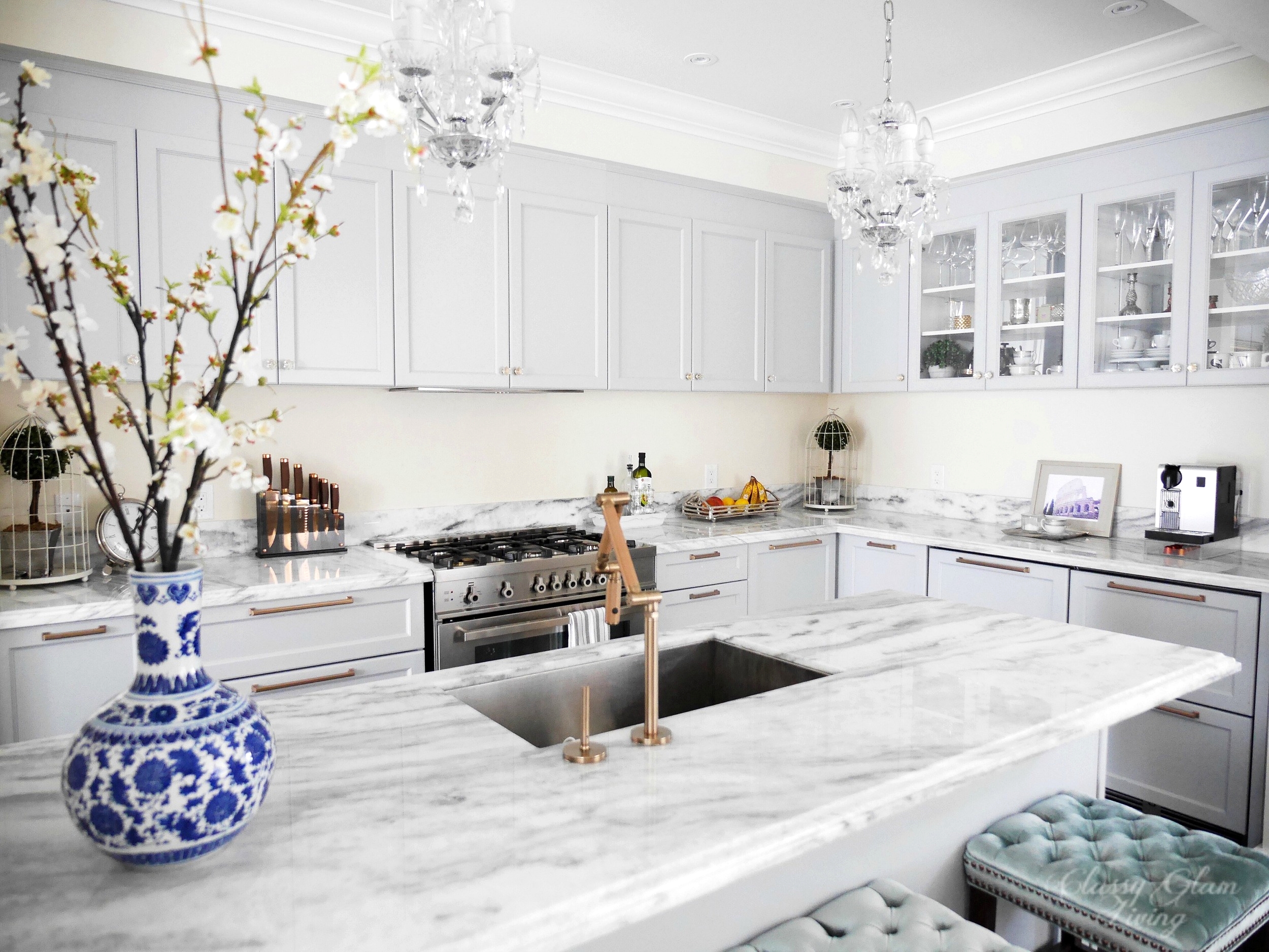
***** SEE OUR KITCHEN COUNTERTOP REVEALED HERE! ******
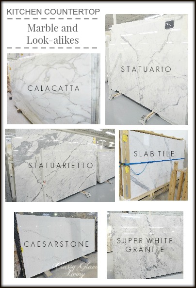
CLICK TO SEE OUR MARBLE COUNTERTOP ALTERNATIVES
Using marble for kitchen countertop and backsplash is ever more popular nowadays. We see the most beautiful kitchens on Houzz and Pinterest clad in some kind of marble, and without a second thought we would put that on our kitchen wish list. But how practical is marble for a real kitchen that gets a fair deal of daily usage (and without an immediate wipe down)? That's why we looked at marble alternatives in this post, and it actually became our blog's most repinned topic... 900+ and counting!
Us marble owners wannabe's are most likely concerned with the three main cons of marble: cost, maintenance, and etching. The nicest piece of marble is most likely double+ the price of manmade quartz stones, not to mention the extra care that natural stones need. Proper sealing of the stone gives it some extra time to avoid severe etching. So, what is etching?
Etching is the dulling effect caused by the chemical reaction of acidic spills on the calcium based marble. Basically, any red wine, citrus juice, tomato sauce, etc that come into contact with the marble would "eat away" at the stone upon contact, and make it feel rough to the touch if left for a long time. Is there an "appropriate" length of time that we can ignore these acidic spills? We did a little experiment to test that out.

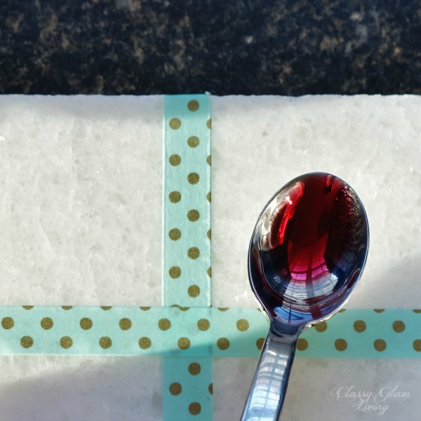
We were given a sample of Bianco Neve at our appointment with the stone fabricator. It is a white marble with beautiful depth and crystalization that sparkles as it catches the light. As lovely as it is, we had to subject it to our household staple and etching culprit - red wine.
This piece of sample has a polished finish but is not protected by any sealant. We separated the sample piece into quadrants...

Applied a teaspoon of red wine on each quadrant...
HERE WE GO!
and did a time lapse test of 30 seconds, 5 minutes, 30 minutes, and 4 hours.

WAITING FOR THE MOMENT OF TRUTH
30 seconds is easily the time of a splash of tomato sauce on the counter while the Mr. is at the stove, before he notices the splash to wipe it up in time.

Don't know which of red wine or tomato sauce is worse, but even the 30-second rule yields a slight etched mark.
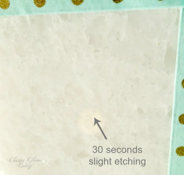
A SLIGHT OVAL DULL MARK IS SOMEWHAT VISIBLE
Next is the 5 minute mark, the dulling is a lot more visible now.

Sometimes we wouldn't notice a splash at the stove until after a meal, which may be around 30 minutes. If that's the case, the polish is gone. I would consider this moderate etching.

Under the reflection, here's how the sample looks like with the time lapse red wine test. The 30 seconds, as expected, has the least visible etched mark. The 5 and 30 minutes etching are comparable in person.

4 hours after the red wine spill... oh that can easily be the time that we notice a spill after a gathering. What will happen then?

After 4 hours, the red wine darkened the spot it occupied on the marble. The spot was clearly dull and also felt rough to the touch.

In comparison to the other three quadrants, the 4 hour red wine stain has completely dulled the polish, even though they were all dulled to some extent.

In this view, the discoloration of the 4 hour red wine stain has created a dark spot at the lower right quadrant.

And that concludes our test. Looks like the 30 second rule also applies to spills on marble!
Did I just make your head spin even more, or did this test help to make your decision process much easier? Will you be able to live with the etched marks on your beloved piece of marble and tell the story behind each mark? Or does your kitchen countertop have to be perfectly polished even with serious daily usage? Our decision may surprise ourselves either way.