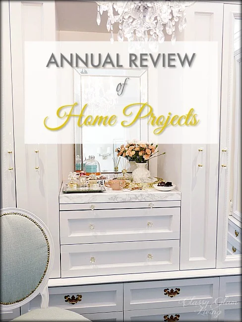
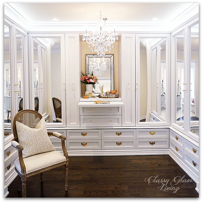
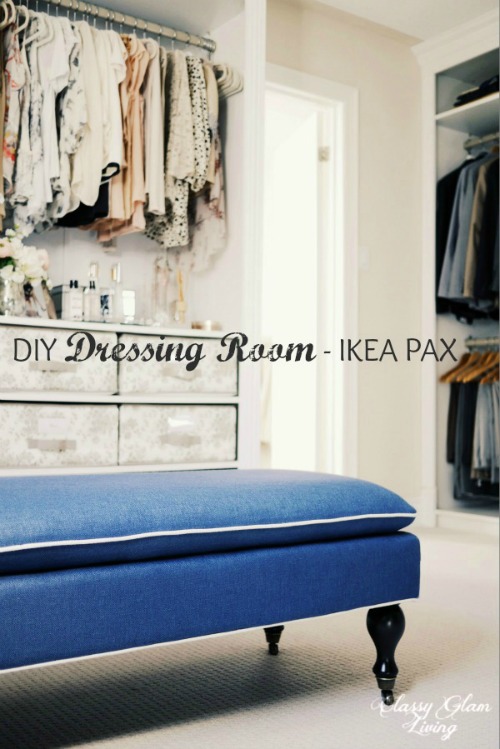
Master Suite Series - Dressing Room

We went for our new house's pre-drywall inspection last month and it was an amazing feeling to see the bones of the house in place.  It gave us peace of mind to see that the builder didn't miss any of our changes to the layout.  Although we were walking on sub-floors, it gave us a good idea of how everything will fall into place once it's completed!

When we got to our master suite, the site supervisor commented on how he appreciated we planned it out.  That's such a nice compliment!  When we got to our walk-in closet, which we opted to remove the wall between the "his and her" closets, he bellowed out, "love how you're turning it into a big closet, put in some closet organizers, bada boom bada bing, love it."  OK, I added the bada boom part, but in my mind that was how he would've flowed as he shooted out his vision for our closet =)

Layout Change | Dressing Room | New House | Classy Glam Living

Closet organizers are great - they ensure there's a place for everything and everything in its place. They make the morning rush all the more efficient and laundry sorting a joy (ya right).  But if you've been following along, you know that installing closet organizers is seemingly undermining the Mr.'s love to build.  He's always up for a challenge, and knowing him, he now wouldn't settle for anything less than our previous dressing room.  

The new dressing area isn't as large as our previous dressing room, and we would need to make some design adjustments to enhance the storage layout and esthetic of the storage units.  

My wishlist for the new dressing area includes these enhancements from our previous dressing room:

  • Make the area appear larger with the use of mirrors
  • A counter for our trinkets
  • A valet hook for prepping next day's outfit
  • For the Mr., a pull-out tie rack (just because I also want a pull-out for my scarves)

We've drilled down to 2 options to complete this dressing area.

Option 1 - Installing storage units with architectural details

With a large entrance to the dressing area, the best design would be to play off of the room's symmetry.  And since it would be nice to have some counterspace to put our trinkets, the perfect option to achieve this symmetry is to have a chest of drawers in the middle.  We can then install the hanging units symmetrically on either side of the chest.  The Mr. came up with a quick design sketch for the long wall facing the entrance of the walk-in:

New House Dressing Room Long Wall Sketch | Classy Glam Living

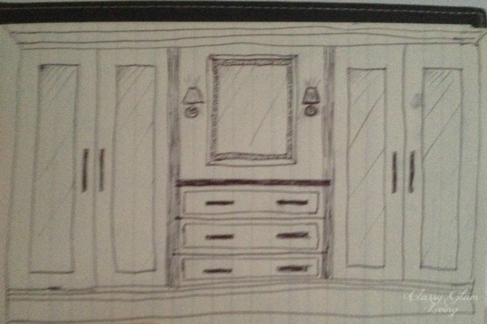
The Mr. is quite an artist, at least compared to me.  That complements me perfectly, since I can't draw at all.  ;-)

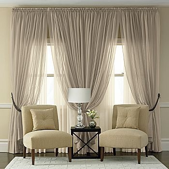
Armed with his design, I headed to my beloved Pinterest to search for the vision that I have.  I want to use mirrors to give the illusion of a spacious dressing area and also to reflect some light from the master ensuite across the hall.  

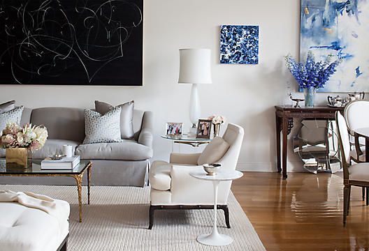
Of all the dressing rooms that I've pinned, I think this one below speaks to me the most.  Its colour tone is so serene and elegant, with the full length mirrors reflecting light all around the room.  The built-in dresser in the middle of the room provides ample counter space and drawer storage for easy access to daily essentials.

Image via Atlanta Homes

Image via Atlanta Homes

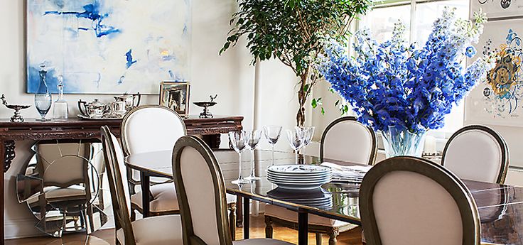
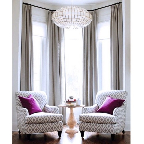
Here's another dressing room that illustrates the use of mirrored doors on the storage units, which are placed on either side of the middle built-in chest of drawers.  Ours won't be quite as large!

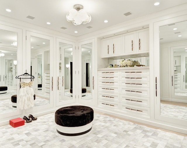
We may choose to go with our reliable IKEA PAX as the main storage units again.  As for the middle chest of drawers, the Mr. may have to custom build them, depending on the actual measurements of the room.

Option 2 - Boutique style walk-in closet

MirrorS, MirrorS, on the WallS...  Option 1 was all fine and dandy, but then who can forget this moment from the movie "Sex and the City 2"?

Yup, my jaw would drop just like Carrie Bradshaw's and hear the music of heavens at the sight of such a beautiful dressing room.  But don't be silly, this is not a request to the Mr.!  It does, however, give me another inspiration.  Instead of the closed storage with mirror doors, how about we go with a boutique style dressing area?  One with open hanging racks, storage and display shelves, and brightly lit hanging areas...  who wouldn't want to go shopping right in the morning?

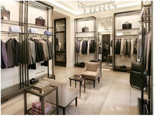
Instead of using mirror doors, we can install mirrors behind the hanging racks and shelves.  Keeping everything open and backed by mirrors would also give the illusion of a large area.

So, which option do you think we should go with?  Open or closed?  Dust or no dust?  Traditional organizers or boutique style?  

Refinishing Plans for Vintage Night Tables

BEDSIDE NIGHT TABLES REFINISH DIY | CLASSY GLAM LIVING

If you follow me on instagram, you might've noticed that we have a work-in-progress pair of vintage bedside tables.  It's a perfect though small project for the Mr., who has been feeling restless through this drought of home projects as we continue to long for the completion of our new house.  

Funny thing was, I wasn't really looking for bedside tables, but rather a sideboard for our dining room.  Since I had previously lucked out with a vintage piece of console table, I decided to try my luck again for a vintage sideboard.  

Of course, when my intent was to look for something specific, I would never find it!  Doesn't this always happen when we shop for anything?  Well, everything happens for a reason...

I've wanted to replace our current bedside tables with ones that have storage, as in the mirrored bedside tables/ cabinets mentioned in this post.  However, most of the nicer ones almost always come too wide.  That may not work, considering we will only have 30" on either side of our bed to work with in our new master bedroom,  Not to mention, a nicer pair would cost close to $1000, if not more.  I've been holding back in an attempt to find a (much) better deal.  

But I guess something is just not meant to be.  Lately, I've started to re-think about the mirrored bedside tables, and wondered if that would be too much mirror with our mirrored trimmed headboard.  

MIRROR FRAMED HEADBOARD | CLASSY GLAM LIVING

So, instead of finding a sideboard, I had ideas churning in my head when I saw this pair of bedside tables.

PAIR OF HENRY LINK BALI HAI BEDSIDE TABLES | CLASSY GLAM LIVING | DIY REFINISH

Faux bamboo furniture is making a comeback from its mid-century hollywood regency hype.  This pair of bedside tables were from the Henry Link Bali Hai collection...  from the 70s!  I love the bamboo detailing, and how the table top is curved along the faux bamboo front legs.  The rounded and curved detailing echoes our curvy headboard frame.  I showed the photos of the pair to the Mr., told him about my big plan for them, and waited for his judgment.  The Mr. agreed to once again be my DIY'er!  

The tables are of good quality, and drawers were built with dove tail joints, something that we no longer see in modern furniture construction.  

DOVETAIL JOINTS DRAWER CONSTRUCTION | CLASSY GLAM LIVING

As you can see, the pair are of the same style but one was painted over, and the other was in its original glory.  That didn't matter to us, since we were going to refinish them with our design in mind.

HENRY LINK BALI HAI BEDSIDE TABLES REFINISH DIY | CLASSY GLAM LIVING

I'm looking to paint the pieces over in a bluish grey colour, that'll give some contrast to our linen coloured headboard.  That's my part in this DIY project, figuring out the paint colour!  Thinking of doing a high gloss on this piece, that'll make it look a bit more modern and elegant.

All our trips to stone fabricators have made marble even more appealing to me.  My plan is to remove the existing top, and replace it with a piece of statuario marble fabricated in the exact shape. The bluish grey paint colour would complement the grey veining of the statuario marble.  The Mr. has already gotten the backing and the top off of the units...  he's really anxious to start!

REMOVE BACKING OF FURNITURE | CLASSY GLAM LIVING

REMOVE BACKING OF FURNITURE | CLASSY GLAM LIVING

UNSCREW TOP OF BEDSIDE TABLE | CLASSY GLAM LIVING

UNSCREW TOP OF BEDSIDE TABLE | CLASSY GLAM LIVING

TOP AND BACK REMOVED | BEDSIDE TABLES REFINISH DIY | CLASSY GLAM LIVING

TOP AND BACK REMOVED | BEDSIDE TABLES REFINISH DIY | CLASSY GLAM LIVING

We're not planning to keep the original drawer pulls, even though it's probably a big no-no to replace them on a highly sought after piece of vintage furniture.  We would rather finish it to our liking since we're already painting it over and such.  I think a set of simple brass bail drawer pulls would complete the look.  I also like the lucite pulls, with the rings picking up the bamboo ring details.  Here are some of my top choices:

sources:  1 AND 2.. QUMUSE; 3. SIGNATURE THINGS.COM; 4. A ROSE RAMBLING

sources:  1 AND 2.. QUMUSE; 3. SIGNATURE THINGS.COM; 4. A ROSE RAMBLING

This easy peasy refinishing project should keep the Mr. occupied for a little bit.  We'll have a ton of projects to start when we move in.  Even the little man has volunteered to help paint the walls for his room!

Until then, stay tuned for the reveal of the refinished bedside tables!

Have you scored a diamond in the rough lately?

Design Inspirations for Our New Dining Room

Dining Room Design Board | Classy Glam Living

When I saw the most recent sale of Get the Look of Downtown Loft  at One Kings Lane, my heart skipped a beat.  Not because of the items for sale, but the inspirational photos of the living and dining areas show a layout just like that of our new house!  The styling is impeccable - light walls as the background for statement art pieces, an elegantly furnished sitting area, and a traditional dining area with an abundance of natural light.  I think One Kings Lane just read my mind!

I've previously talked about how our living/ dining areas are adjacent to each other.  Here's the design board for our living room.  I'm hoping it'll be be loaded with natural light during the day, just like OKL's photos above.

Here is our furniture plan for the dining area, which is open to the living area, similar to the One Kings Lane photos above.  

Living Dining Layout | Classy Glam Living

The dining area is approximately 18' x 14', so our existing dining furniture will fit in nicely.  The left side of the dining room will look similar to our previous dining room, where the console table and mirror are placed against the wall.

Dining Room Setting | Classy Glam Living

However, not everything decor-wise will remain the same at the new house.  Afterall, moving into another house is the best time to try something new!  

Wall Treatment

The trim-crazy Mr. will no doubt still want to have trims done for the living and dining areas.  This time around, instead of a chair rail separating the upper and lower walls, the wainscoting will be from floor to ceiling.  The chair rail draws the eyes along the walls, and is more approriate for a large space.  With our smaller ground floor at the new house, we want to lead the eyes upwards and that can be achieved by a full floor to ceiling wainscoting.

The style of the wainscoting will be built out, rather than installing rectangular frames on the walls like we did for our previous dining room.  We used a similar built-out effect on our kitchen island.  We like the minimalist look of inset frames, while the architectural detailing still gives the area an elegant feeling.

BUILT-OUT PANELLING - FRAME IS INSET

BUILT-OUT PANELLING - FRAME IS INSET

FINISH LOOK OF BUILT-OUT PANELLING...  JUST IMAGINE THAT ON THE WALLS!

FINISH LOOK OF BUILT-OUT PANELLING...  JUST IMAGINE THAT ON THE WALLS!

WINDOW TREATMENT

With the living and dining areas being open to each other in a smaller area, we would like to go with less heavy fabrics for draperies.  A softer look helps to open up the space, while still looking elegant.  I went from considering the extreme of a sheers-only look...

SOURCE UNKNOWN.

SOURCE UNKNOWN.

... to a sheer on sheer look...

... and then I saw this set of gorgeous linen drapes.  Linen still has the light and airy feeling I'm opting for, but it has a slight weight to it that gathers nicely with French pleats.  Pair the panels with some nice rods, and we've got a winner!

TWO CHANDELIERS ABOVE DINING TABLE

I had been searching for the longest time for the right dining room lighting fixture at our previous house.  At the new house, look no more!  We took our chandeliers above the kitchen island with us, and we'll put up the pair above the dining table!  That'll for sure be a statement piece of jewelry for the dining room!  This is my attempt to visualize the look =)

Dining Room with 2 Chandeliers | Classy Glam Living

STATEMENT ART PIECE

At the right side of the dining room, we're planning to hang a statement art piece that measures around 4'H x 3'W.  We can leave that wall as is, but it will look too bare.  Putting an armchair at the corner with a sidetable would fill up the space nicely, while creating an extra sitting nook...  for someone ready to jump to help with dinner, or someone anxiously waiting to nab at food coming out of the kitchen (aka me)..

BAR CART OR CONSOLE TABLE?

In place of the armchair at the corner, we originally thought that would be an excellent spot for a barcart.  Since we already have a console table, I think making it into a bar area looks just as attractive, similar to this look:

THE DINING RUG

Ahhhhh, the dining room rug.  The search for it seems never-ending.  It's a similar situation as the dining room light fixture.  Getting the bang for the buck on these investment pieces is just not an easy task, not to mention other factors that we need to consider.  From the rug size and style, to practicality like material and pile, it's been a long ride. We prefer rugs with a border, with a muted tone on tone pattern or neutral colours that are subtle against the statement art piece.  In short, we've (finally) narrowed down to these several looks. 

This pretty much wraps up the ground floor design of our new house.  "Small space, big living" is our new motto, and we'll achieve that with practical design of our home.  From our entryway, kitchen, living room, and now the dining room, we want to (and need to) utilize and enjoy all the space available.  We don't have the luxury of extra space for a "display only" living and dining "museum", though we'll design our space with luxurious touches that are also practical for everyday living.  

Practical design is also key when you have a kiddo who grabs any stick-like objects and starts playing floor hockey right then and there...

CAN'T WAIT TO MOVE IN!